
Three Model Organisms For Taste
...

(a continuation of yesterday’s post)
Reddit Vexillology
Vexillology is the c. elegans of aesthetics - the simplest model organism that lets us observe dynamics of interest. I haven’t read enough MFA books to do more than relay the thoughts of my betters, and you probably haven’t either. But anyone can have opinions on flags.
If you’re like me, you learned the following code of good flags:
They should be so simple that a child could draw them.
No images, no “busy” areas, and - for God’s sake - no text
The rule of tincture: “never put metal on metal, or color on color”. In medieval heraldry, “metals” were yellow and white (sometimes implemented with literal gold and silver) and “colors” were every other color (except black, which is a “fur” and has its own rules). A good flag shouldn’t have a metal touch another metal, or a color touch another color. So the French tricolor (blue then white then red) is okay, but a hypothetical (blue then red then white) tricolor wouldn’t be okay, because blue would be touching red, which would be “color on color”.
Every so often, a US state will decide that its flag is politically incorrect and sponsor a contest to design a new one. Then online vexillologists will go over the entries, savaging any that violate the code. “Look how busy this one is! It has four different colors!” “Oh god, this one literally included text! Can you believe it!” They’ll moan and scowl and ask why everyone can’t be more like Indonesia. Good old Indonesia, they know how to follow the rules:

But the non-Indonesians are starting to fighting back. Search the keyword “reddit vexillology” on X to make contact with the Resistance.
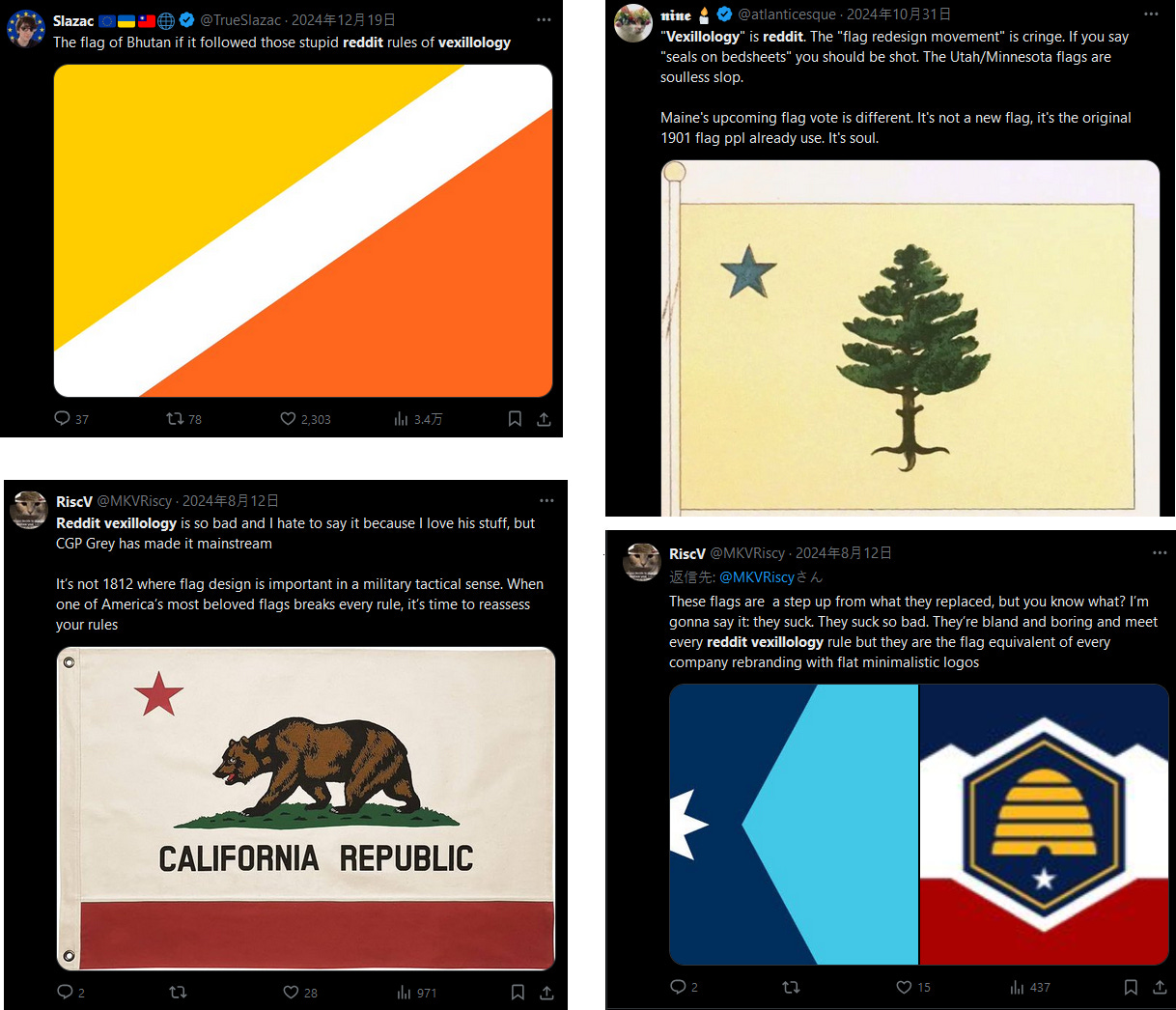
There are even memes!

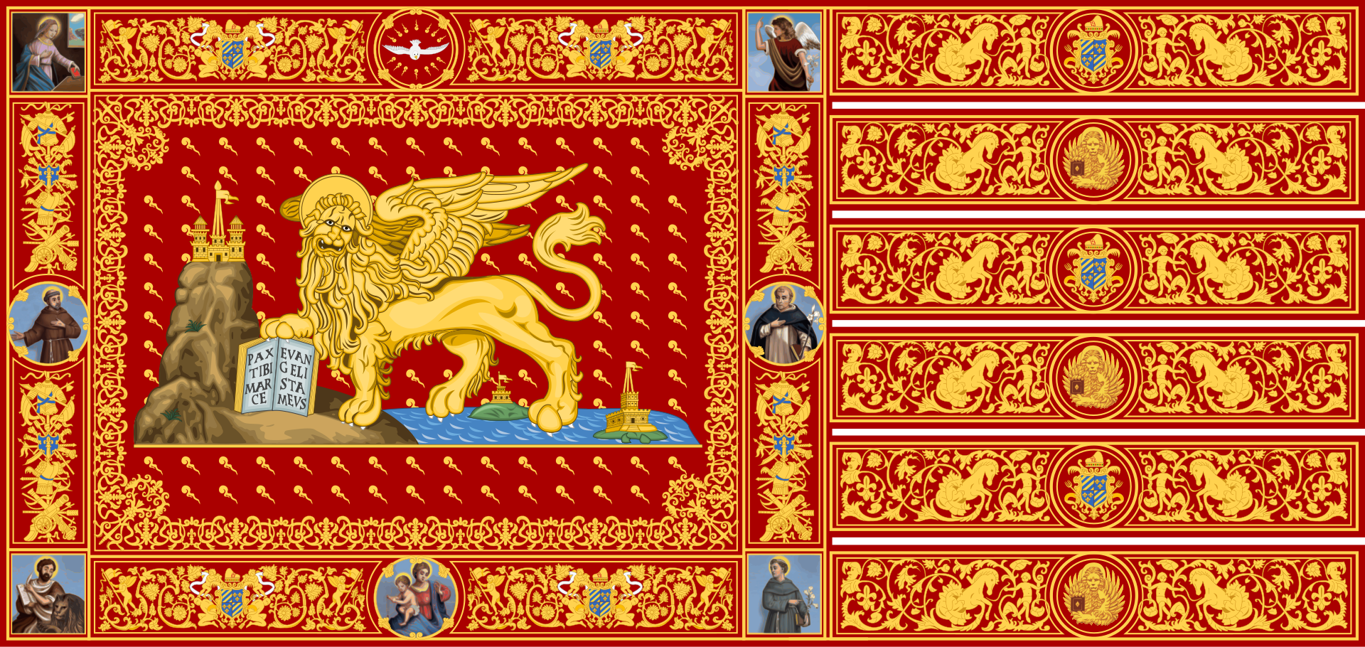
If the vexillological resistance marches under a banner, it must be the flag of medieval Venice (c. 1000 - 1797):
The Reddit Vexillologist arguments are:
Flags were originally intended to distinguish friend from foe on the battlefield. To serve this purpose, they ought to be easily distinguishable from far away, through smoke, dust, etc. There’s no way anyone could read text in these conditions.
Sometimes your militia will need Betsy Ross - a random seamstress without fancy equipment - to sew them a flag out of bedsheets. Your flag should be simple enough that Betsy can do a good job.
Patriotic young children will sometimes want to draw flags, and we should let them. This means no complex shapes that a child would get wrong.
The Rule of Tincture is obviously correct. A color on a color looks like crap! Come on, can’t you see this?
The resistance counterarguments are:
Battlefield recognition is no longer a main use case for flags, so this is no longer relevant. Besides, the medieval flags, which actually did get used in battle, mostly break your rules. You are trying to out-medieval the medievals.
A modern Betsy Ross could order the most complex flag in the world off CafePress for $19.99 with same-day shipping.
Young children aren’t going to object to having to draw a lion with wings. Young children love drawing lions with wings. No child has ever said “I hate lions with wings, I wish my country’s flag was something cool, like a red square on top of a white square.”
The origins of the Rule of Tincture are unclear, but plausibly related to medieval craftsmen using literal metals, and crafting heraldic crests using techniques where it was practically difficult to get metals to join with other metals (or colors to join with other colors) properly. It would be a wild coincidence if the limitations of medieval craftsmanship just so happened to correspond to timeless aesthetic truths. You just think flags which break the rule look like crap because you’ve been so acculturated into the rule that any violation of it feels jarring on a preconscious level.
Many of the most iconic flags in the world, including America, Brazil, California, Spain, the Vatican, Iran, and the United Nations, violate the conventions. A theory of vexillology where all of these are wrong would be like a theory of drama where Shakespeare sucked.
To all of these objections, I would add a broader one: sure, the Reddit vexillologists say that this is all about what’s easy for soldiers and children and Betsy Ross. But flags from back in solders/children/Betsy’s day were more complicated (eg Venice). And in every other form of art, the past two hundred years have seen detail gradually give way to minimalism. Prose has become less flowery, architecture has become less ornamented, dress has become plainer. And now there’s a movement for minimalist flags. Hmmmmmm. Are you sure you’re thinking of poor Betsy, or have you been unknowingly seized and by the zeitgeist and dragged off?
I think this is a successful model organism. We meet all the same considerations of context, history, aesthetics, and pattern languages. But here it’s obvious that many of the “rules of good taste” are obsolete historical artifacts (and pseudo-historical artifacts!) that got trapped because people who are familiar with them think everything else “looks wrong”, and which threaten to homogenize the field into a slurry.
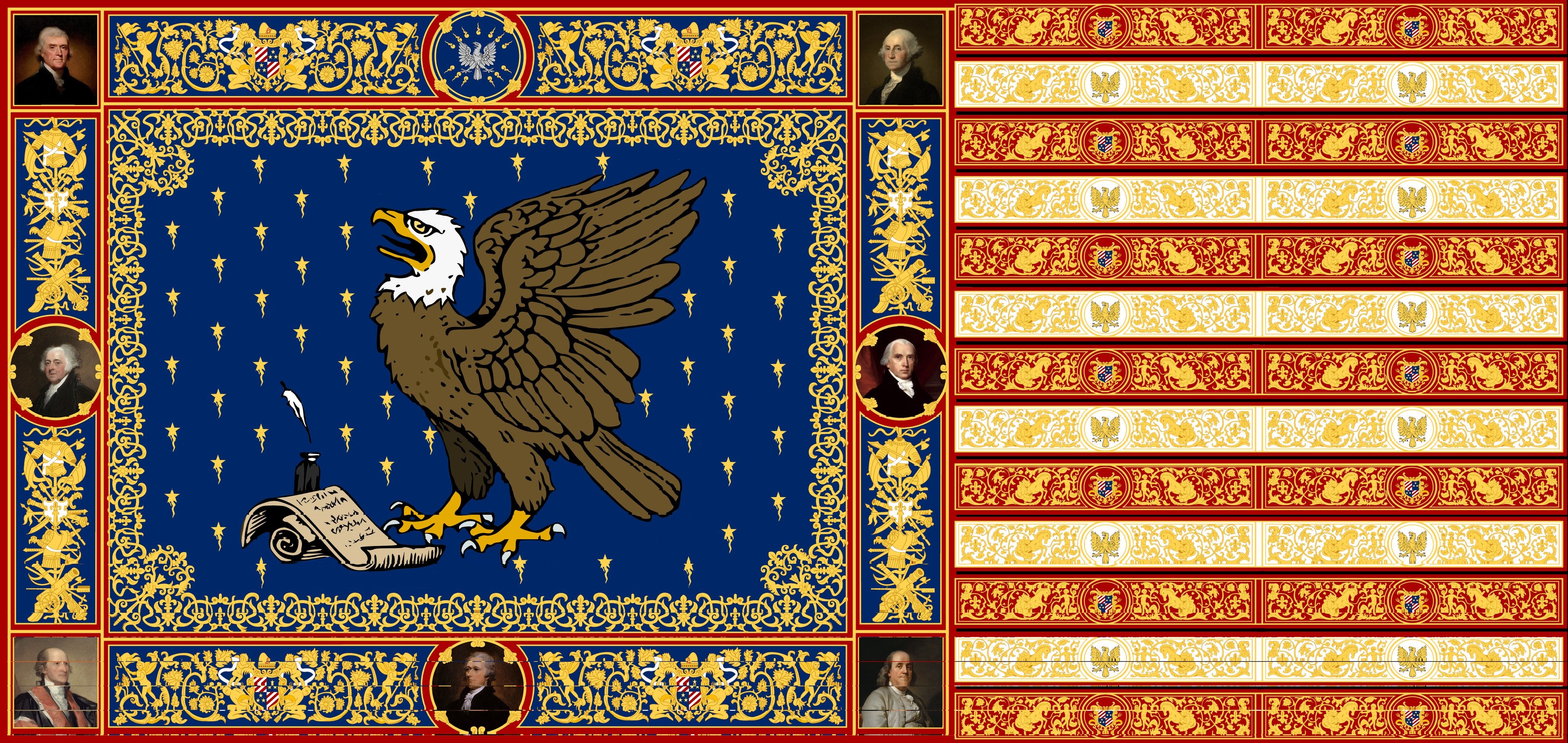
And that’s why I think American greatness depends on adopting X user @Sven_Etienne’s US Flag In The Style Of Venice:
2: Movie Plot Holes
There’s a whole literature on why the eagles couldn’t have flown Frodo to Mordor (or, if your answer is that the Dark Lord would have noticed when they got close, fly him halfway). I’m not touching that one with a ten-foot-pole.
Here’s one that AFAIK nobody defends: when Obi-Wan was charged with hiding baby Luke from Vader, how come - out of an entire galaxy of places to conceal him - he placed him with Vader’s stepbrother, in Vader’s hometown, without even changing his last name?
On the one hand, this is extremely dumb, and makes me think less of George Lucas. On the other, it doesn’t change my enjoyment of Star Wars at all. Hundreds of millions of people have watched and loved Star Wars, and either not noticed this, or loved it despite this flaw.
Is this what people mean by “paying attention”? You might not think of these things on a first or second viewing. But some movies reward careful thought by showing hidden depths, and others punish it when a seemingly coherent story breaks down into nonsense.
You can go further. A nitpicky uber-nerd will spot that Ultra-Man’s laser is described as having a range of 1,000 feet in “Ultra-Man Behind The Scenes”. But in Ultra-Man #88, he was seen flying above the Empire State Building and shooting someone on the ground, even though the building is 1,250 feet tall. Is a comic series that doesn’t make any of these mistakes “better” than one that does? Are people who care about these things better, more tasteful readers than the rest of us?
Maybe. A superhero story that hangs together nicely is a more elegant and impressive artifact than one which constantly contradicts itself. This doesn’t affect whether normal people like the story or not, but we already agreed that taste is in many ways supposed to stand apart from the judgment of normal people (who like slop).
Is this just telling us that we respect taste when the taste-haver is an aristocrat with strong opinions on wine, but don’t respect it when the taste-haver is an uber-nerd with strong opinions on Ultra-Man’s blaster range?
Tech Company Names
I wanted to title one of the articles in this series “Against Taste”. In the end, what stopped me was one of my model cities posts. A project mentioned there is called Infinita. The project is fine, but I can’t get over the name. Sure, infinity is cool. But that’s exactly the problem. It tries too hard for an easy win. What’s cool? Infinity. How do you turn something into a name? “A” at the end. You feel like they’re manipulating you into feeling impressed.
But Infinita’s predecessor Vitalia had a good name. Superficially it’s the same idea: cool concept + A at the end. But it combines a useful description (Vitalia focused on biotech and longevity) with a subtle nod to its inspiration and chief supporter, Vitalik Buterin. Even though the two company names superficially resemble each other, those of us who really understand tech companies realize that the latter is actually quite clever in context.
This is taste. But it doesn’t seem exactly like any of the eight categories at the beginning of yesterday’s post. It’s closest to “novelty and innovation”. “Infinita” doesn’t do anything new or interesting with tech company names; it just takes the absolute easiest lowest-hanging fruit there is. But it’s more than that; “City Project Investors, Inc” is also extremely easy and not new or interesting, but it doesn’t seem as bad. Above, I used the word “manipulating”, and I sort of stand by that. It’s too much of an “easy win” - too good with too little work.
Part of my “Contra Everyone On Taste” crusade is to be against this sort of thing. There are people who think that any poem that rhymes is an “easy win” and therefore tasteless, or any art that looks like anything, or any building with ornament or symmetry. I hate this outlook, but then what do I mean when I admit there’s some sense in which easy wins are bad?
There was an AI generated poetry Turing Test a while ago. People revealed their bad taste by liking some AI poems that I considered absolutely horrid:
Yet in this fleeting dance, we find our grace
For time’s own rhythm guides us, slow or fast
Each second lived, a treasure we embrace
For in its flow, we find our lives amassedThough time may steal what once was bright and true
The sun will rise again - and so shall you
Bits of this are nonsensical - why would you use the word “amassed” there? do we really embrace treasures? - but this isn’t the main problem. If it were only that, it would be no worse than Ultra-Man’s blaster having the wrong range. I think what makes me violently allergic is that this is stringing too many cliches together. “The sun will rise again - and so shall you”? Really?!
Maybe this isn’t actually a cliche, I’ve never heard that particular phrase before, but it’s the sort of thing that could be a cliche. I don’t know how else to describe it! You’re trying to manipulate me by doing easy things that you know will work, and the fact that it slightly does work just makes it even more galling!
More on this topic later.