
Never Cross a River Four Feet Deep on Average
Guest post by Alexander "Sasha" Putilin


[This is a guest post by 2024 ACX grantee Sasha Putilin. I encourage any ACX grantees who are interested to write about their projects. - SA]
The results of my ACX Grants 2024 project are in.
The project attempted to replicate the 2023 study “Learning at your brain’s rhythm: individualized entrainment boosts learning for perceptual decisions”. It claimed that if you read a person’s brain waves, figured out an individual peak alpha frequency, and flashed a bright white light at that frequency, then they learned a certain perceptual task faster.
Why bother? The result hinted that learning may depend in part on how well the brain keeps its rhythms coordinated. In other words, perceptual learning may rely on an internal brain metronome. If flickering light could act as an external metronome, it might help the brain maintain the right rhythm and learn faster.
The study offered an invitation to develop new frontiers of neuroscience and biohacking. If the effect generalised to other types of learning, you could build a learning helmet: put it on your head, let it read your brainwaves, flicker light tailored to your individual brain — and you learn a new skill quicker.
And no, it didn’t replicate. Most likely it can’t replicate, because the effect is probably not real. The original study obscured the data with summary statistics. Running a $32,000 replication was excessive. We could’ve caught the issue with this study if we simply looked at the original data carefully.
*record scratch* *freeze frame* Yep, that’s me. You’re probably wondering how I got here. Here’s the story.
The original study
“Learning at your brain’s rhythm” tested participants’ ability to learn an artificial task — distinguishing between radial and concentric patterns.
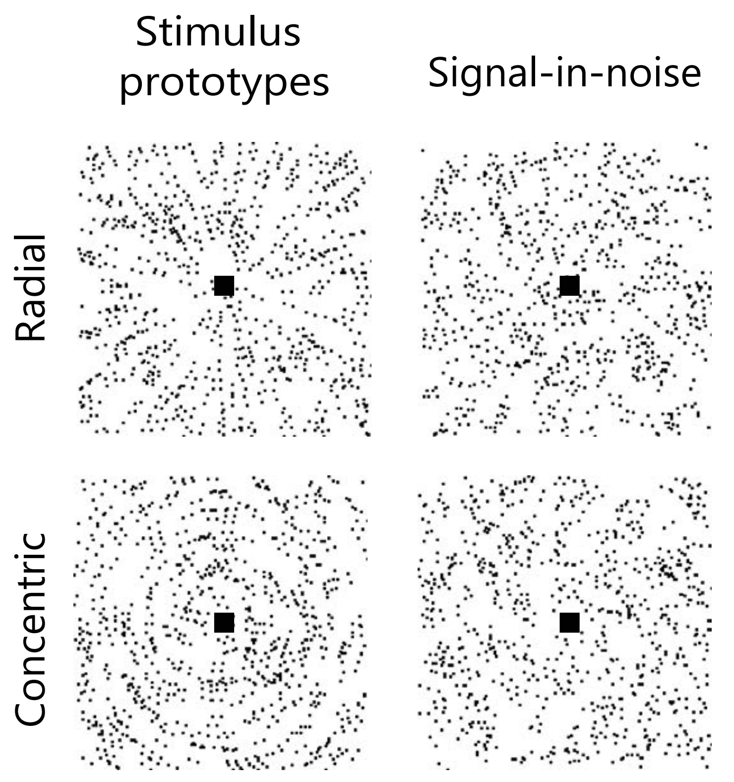
The patterns on the left are easy to tell apart — they are prototypes. Those on the right are more like the actual task. They mask the underlying pattern in noise, with the noise level varying around ≈75%. Participants had to classify patterns fast: they were shown on the screen for just 200 ms, after which they had 1.3s to pick an answer.
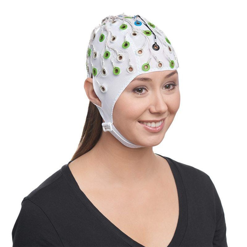
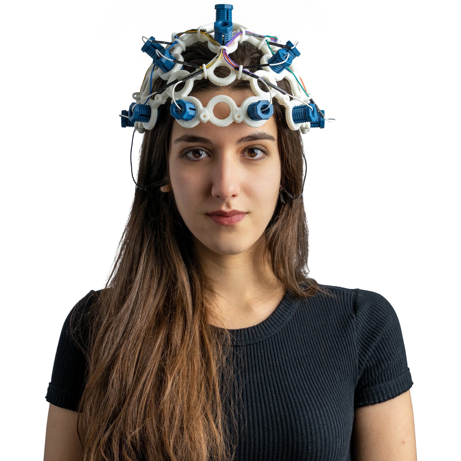
During the study participants wore an electroencephalography (EEG) cap — a mesh of electrodes on the scalp that recorded their brain rhythms. The EEG was used to tune the flicker to each person’s own alpha frequency and to track what was happening in their brain as they learned.
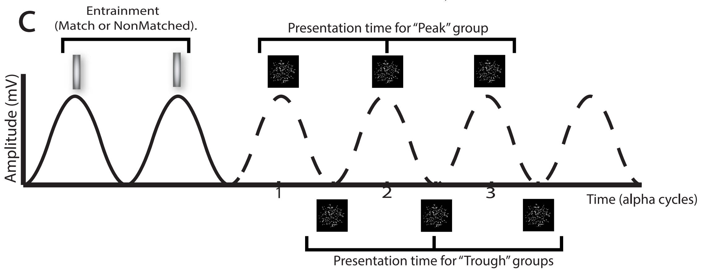
The visual identification task used in the study is the kind of perceptual learning known to be supported by the alpha rhythm: a brain wave in which populations of neurons become more and less excitable 8–12 times per second. The researchers measured each participant’s alpha rhythm, then experimented with entrainment — the practice of nudging brain waves into sync with a rhythmic external signal, in this case a flashing light. Visual neurons naturally respond to flickering light, so a flicker tuned close to a person’s natural alpha rhythm can either reinforce it or pull it off-beat.
The researchers also experimented with timing the patterns to either the peaks or troughs of the alpha rhythm. They tested four groups of 20 participants — three entrainment conditions plus a control:
Control: The light flashes randomly, unrelated to the alpha rhythm.
P-match: The light flashes at the frequency of the alpha rhythm, strengthening it. The pattern is then shown at the peak of one the following alpha cycles.
T-match: The light also flashes at the frequency of the alpha rhythm, again strengthening it, but the pattern is shown at the trough of a cycle.
T-nonMatch: The light flashes at a frequency offset by ±1 Hz from the alpha rhythm, nudging the participant to maintain an unnatural (for them) alpha rhythm. The pattern is shown at the trough of a cycle.
The use of an arrhythmic control group can be challenged — could this distract the participants from the task and confuse their alpha rhythm? But the experimenters likely wanted to keep the control and experimental groups as similar as possible, and that meant forcing the control group to also look at quickly flashing lights. Under that constraint, arrhythmia is the best one can do.
Participants completed ≈800 repetitions of the task, later analysed in 8 blocks of ≈100 trials each. Each trial followed the same sequence:
Entrainment: 15 flashes of light, in the pattern corresponding to which group the participants were in.
Delay: a short pause of ≈100–350ms, tailored to the participant’s alpha rhythm
Stimulus: a randomly generated radial or concentric pattern shown for 200 ms.
Response: 1.3s to answer using the left/right keys on the keyboard.
Feedback shown for 100 ms: a green check for a correct response or a red cross for an incorrect one
An inter-trial interval, a delay of 1.5±0.25 s.
Repeat.
Every ≈200 trials, participants were encouraged to take a break to reduce fatigue.
On the second day of the study, participants did another 800 trials, but without entrainment (flicker) or feedback. This was meant to test whether any effects found on the first day reflected a non-learning boost — the entrainment temporarily making participants better at the task in the moment — or genuine faster learning that persisted to the next day.
Once the data was collected, they analysed it in blocks of ≈100 trials. For each participant they fit a logarithmic function to block accuracies:
Accuracy = Offset + LearningRate × log(BlockNumber)
Here are their two headline charts:
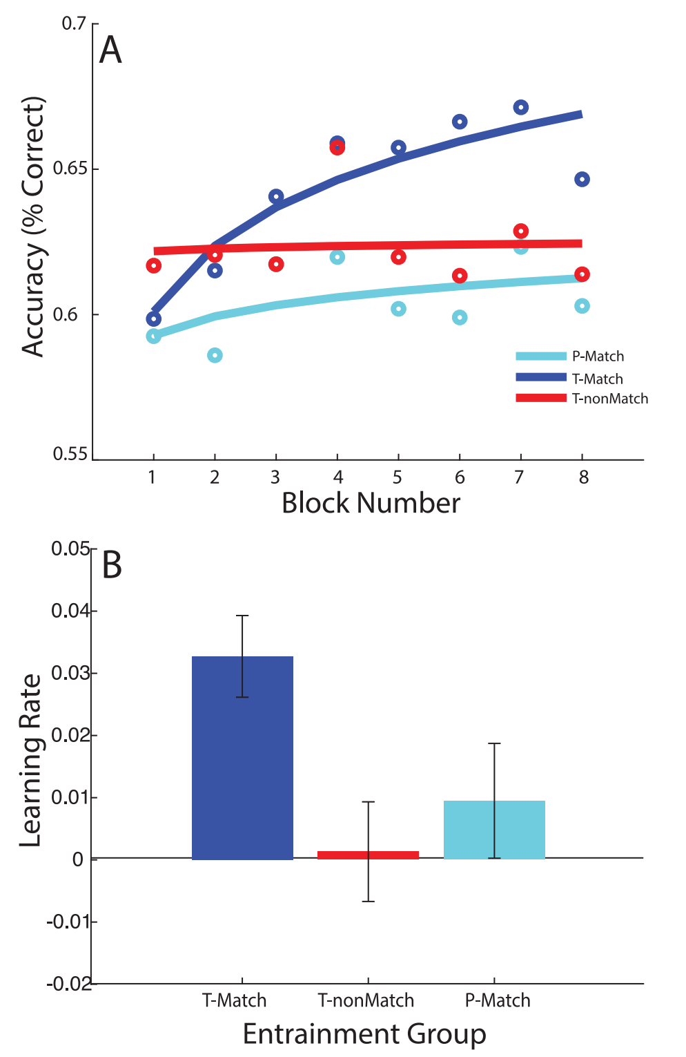
The study seemed to succeed! People in T-match (strengthened alpha rhythm with trough stimulus presentation) learned the task faster than people in the other two experimental groups. This seemed consistent with theoretical arguments linking alpha phase to moment-to-moment visual excitability: at the trough phase the visual system is more ‘open’ to incoming signals, and at peaks it’s more suppressed, which can affect detection performance.
The Replication
I was running on a tight budget, so in place of the original 80 participants, I got 12.
To get more out of the smaller sample, I adjusted the design:
On the first day of the experiment, each participant got either the P-match condition or the T-match condition.
Then, on the second day, they got the opposite.
Ceiling effects were a risk here — people might “learn everything they could” on Day 1 or soon after starting Day 2. But the reported 3× difference in learning rate should leave enough room for the “T-second” participants to still show learning.
This design still permits a between-groups analysis on the first day alone — as in the original study. But it also permits a within-participant analysis across both days, with each person acting as their own control — important when the sample is small, since it strips out between-participant variability.
Just like the original study, the replication was double-blind: neither I, as the experimenter, nor the participants knew which condition they were receiving on a given day.
I also had to settle for cheaper hardware. The original authors used a 63-channel EEG system that probably cost between $50k–$100k. I used a cheaper OpenBCI Ultracortex “Mark IV” EEG Headset with an 8-channel Cyton Board and ThinkPulse Active Electrodes. The total cost was around $2k.
Although the decision was forced by the budget, replicating the study on consumer hardware had one important advantage: it tested whether someone could plausibly build learning software for cheap headsets, or perhaps a dedicated consumer learning device.
Downstream of the different hardware, I changed some technical details of measurement and post-processing. These changes hopefully improved the replication’s accuracy and precision over the original — see the discussion in Appendix.
I also needed participants. Thanks to you, the readers of Astral Codex Ten, and members of various London communities, for volunteering to help with this. Fifteen London-based people responded. Two dropped out due to poor fit (literally) with the headset. One participant’s run was used to test the full procedure and excluded from the sample (declared in the preregistration). The other twelve formed the sample.
Here is what a minute of the experiment looked like:
If you are bored just from watching this video, imagine being a participant stuck in this loop for an hour. It does get boring pretty quickly, and breaks only somewhat help.
Results: the effect is not replicated
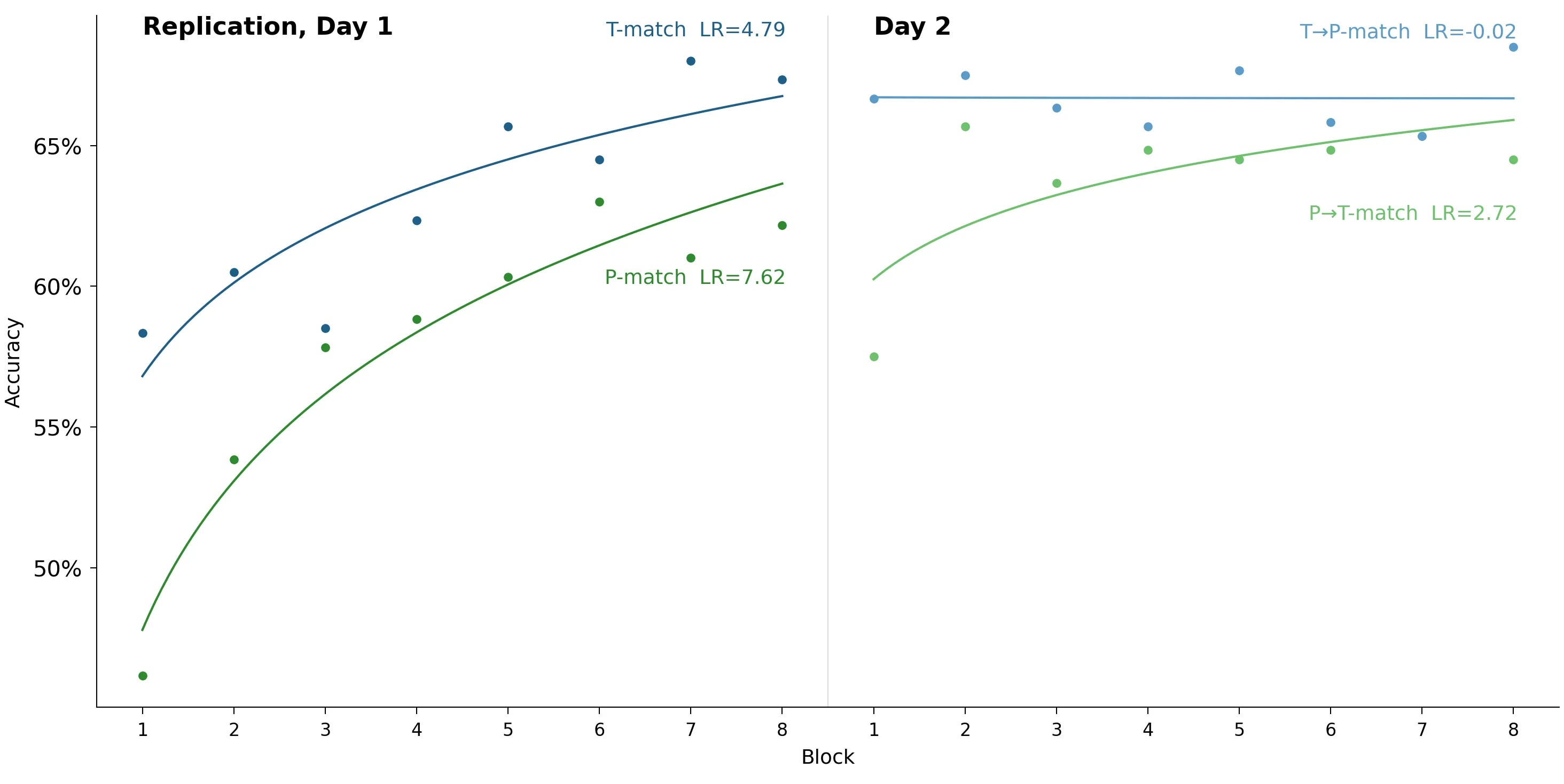
The T-match group started with higher accuracy. This boost was statistically significant (p = 0.016), but not present in the original study, so we are not confident in its reality.
The original study’s central finding — that the T-match group learned three times faster — is absent. The result isn’t significant, but if anything it points the other way: the P-match group learned faster on Day 1.
On the second day, both groups hit the ceiling and there was little further progress.
Why are our results so different from the original study?
Let’s disaggregate learning rates by participant.
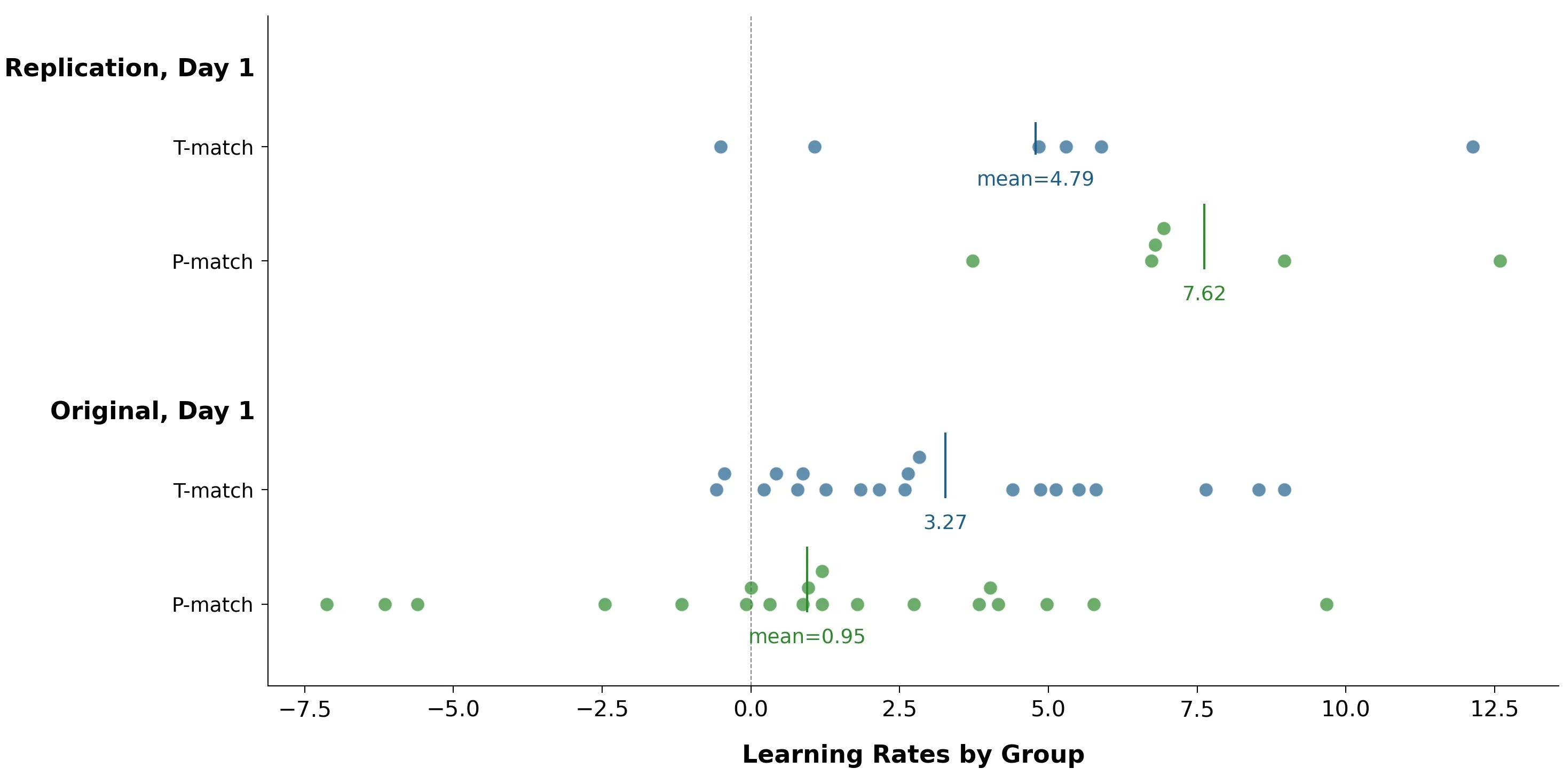
The biggest difference is that in the original study, several P-match participants had large negative learning rates — they got worse over the course of the study. In the replication, nobody was like this.
Negative learning rates are theoretically possible: in what people sometimes call “beginner’s luck”, a novice starts out using (good) intuition, then gets worse as they begin over-focusing on their errors. But this task is simple enough to suggest an alternate explanation: getting bored or tired. Participants had to look at slightly different noisy patterns 800 times. By pattern #799, maybe they were just sort of phoning it in.
This could still be a meaningful finding: the right type of EEG entrainment helps participants maintain focus on long, boring tasks. But it’s probably an artifact: there isn’t anything similar in the replication.
Also, people generally associate improved focus with better learning. So if this improved focus were real, you’d expect it to show up in positive learning rates too, even if less dramatically. There may be a hint of this in the above data, but nothing substantial.
The results of the original study are very fragile
For 17 of the 40 data points in the original study’s P-match and T-match groups, removing that single data point would push the study outside the traditional p = 0.05 threshold. For example, removing the participant with the leftmost negative learning rate (-7.12) takes the study from p = 0.045 to p = 0.091.
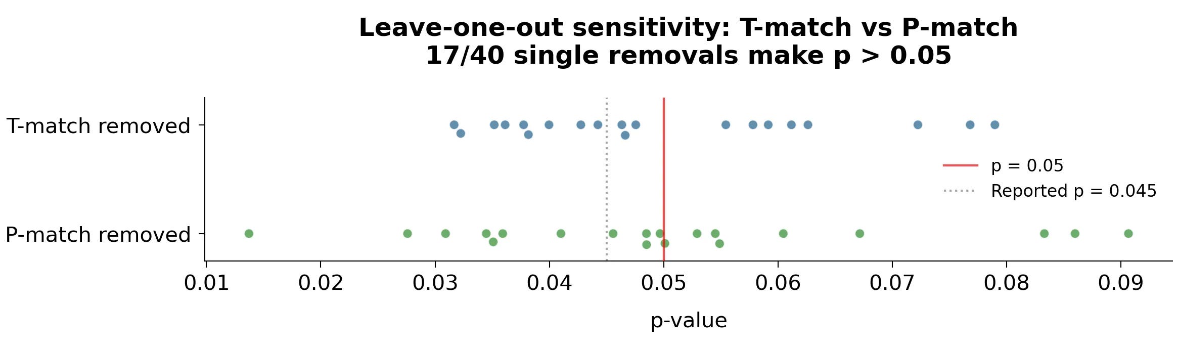
We (Sasha & Scott) think the most likely explanation is that some people in the original study got very bored, and by coincidence they were all in the P-match group. This made the T-match group look better. In the replication, again by coincidence, nobody got that bored.
The original study obscured the data with summary statistics
In their headline charts, the authors of the original study took individual, per-participant data and presented it through two separate averaging procedures. They reported an average learning rate per group, and they fit a curve through per-block accuracies that were themselves averaged across participants. Together, this made T-match’s advantage look like a more-or-less uniform group-level effect.
The individual data tells a different story: the difference is primarily driven by a few P-match participants with sharply negative learning rates.
Was this obscuring the underlying data with averages intentional? Absent comment from the original authors, we can only speculate. To the original authors: if you are reading this, I call on you to comment publicly on your work process.
Personally, I’m currently inclined to think this wasn’t intentional:
They published enough data for people to verify their findings — hence the discussion we’re having now.
They discuss many genuine EEG differences between the groups. These are outside the scope of this post, but you can read about them in the original study. Our replication also shows a difference between P-match and T-match — an initial accuracy boost. This boost is largely absent in the original study, but it points to a meaningful difference in visual processing.
Let him who is without sin cast the first stone — I also missed this problem in their data before running the replication.
I was in touch with the original authors (Elizabeth Michael and Zoe Kourtzi) before running the replication — they provided comments on their study, for which I’m very grateful. That said, when I emailed them in January with the replication results and asked for their interpretation of negative learning rates, they didn’t respond to my email or the follow-up.
Setting the question of intentions aside, the observable flaws in this study are part of a broader pattern.
Cargo-cult statistics
Stark and Saltelli define “cargo-cult statistics” as the mechanical, ritualistic application of statistics:
Practitioners go through the motions of fitting models, computing p-values or confidence intervals, or simulating posterior distributions. They invoke statistical terms and procedures as incantations, with scant understanding of the assumptions or relevance of the calculations, or even the meaning of the terminology. This demotes statistics from a way of thinking about evidence and avoiding self-deception to a formal “blessing” of claims. The effectiveness of cargo-cult statistics is predictably uneven. But it is effective at getting weak work published - and is even required by some journals.
The original authors performed the ceremony: collected data, ran t-tests, got a handful of p < 0.05 results, declared significance, and published their paper. But it’s not enough to perform commonly accepted rituals of your profession. The point of science is to look at the underlying data with a critical eye and ask yourself questions like:
Is the effect real, or is it an artefact of analytic flexibility and small samples?
What’s going on with the underlying data at the level of individual participants?
How do we interpret large negative learning rates? Is their absence in the T-match group due to a genuine attentional effect, or to blind luck?
What data should we publish so other researchers can validate our findings? They don’t even properly release per-block accuracies for recreating their headline charts (see further discussion in Appendix).
Why is it valid to fit a Linear Mixed Effects model to data where the overall phase effect is not robust to leaving out a single participant? And why fit this model before showing that the basic data shape makes sense? They do this in the study — but provide no explanation.
These questions matter for getting the science right. But they also matter practically — if we want to build a device that helps people learn faster, we need to know whether the effect is real enough to build on.
Any paper could contain problems like this. And if the original paper is typical of how science is done, science is in deep trouble. What can we do to audit the scale of the problem?
Democratic meta-science with AI
Science is currently a priesthood. A small class of experts has the time, resources, tools, technical fluency, and institutional permission to run a study — or to inspect the logic and machinery behind a published claim. The public is expected to stand outside the temple, read the final PDF, and trust the robes.
This artificial class divide between scientists and general readers would be less of a problem if science were truly open, with data and code freely available. But in this study we have poorly labelled and incomplete data (see Appendix). We also have no original code that was used to obtain it, no analysis code, and no code to plot it.
Reanalysing a paper like this one from scratch used to take enough time and technical effort to deter almost everyone. AI is now rapidly changing this. It’s getting impressive at complex data wrangling, statistical analysis, and data visualisation. The software gap between scientists and regular readers is closing — the hidden code can be much more easily recreated anew.
With this class rapidly disappearing, a new science might emerge. Your local blogger might have better meta-science skills than people doing science at top universities. An amateur with a laptop and an LLM can now do in a couple of weekends an investigation that used to take an expert a month. This is not an exaggeration: while I put hundreds and hundreds of hours into this project, the first versions of the charts in this post did take only a couple of weekends.
If scientists won’t do their job properly, we can start doing it ourselves. The future of science may be more democratic than prestigious: less like priests handing down conclusions, more like a network of readers, analysts, critics, and builders continuously auditing one another’s claims.
If you want to be part of this future, pick an interesting paper with data available online and audit it, recreating key analysis and charts — see if you can find something fishy. Feel free to DM me on my psychotechnology substack. I learned a lot from this replication and I’d be excited to chat.
Acknowledgements
Thank you:
1. Scott Alexander for the ACX grant and ongoing project support.
2. Participants — Adam Langworthy, Alex Rosen, Beriwan Ceren, Clara Yeo, Jon Besga, Joseph Michaelides, Laurie Mercer, Matilda da Rui, Mila Kaplan, Patrick Stevens, Rafael Muñoz Vega, Richard Xie, Shannon Yang, Stuart Wilmot, Zoltán Vér — for your time and effort. As well as for your brain wave data. The real replication was the friends we made along the way.
3. Eric Wycoff Rogers for 3D printing a frame for the headset, and also for running the London Night Cafe in which I spent many nights writing this post past midnight.
Links to code and preregistration
The specific commit that was used for running trials.
Published Data
Replication data is available in the same Github repository as the code. The public dataset includes per-block accuracies for each participant, which are sufficient to rerun the key analyses and recreate the charts in this post when combined with the original study’s data.
EEG recordings and per-trial behavioral data are not released, in order to preserve participants’ privacy.
Post Scriptum
I’m really interested in examining the full dataset from the original study. If you are in Cambridge and can help with getting it, I’d really appreciate your help.
APPENDIX
In-depth comparison of the original study with the replication
This chapter contains many charts that were not critical to the narrative in the main section but are either necessary to disclose for full transparency or simply interesting.
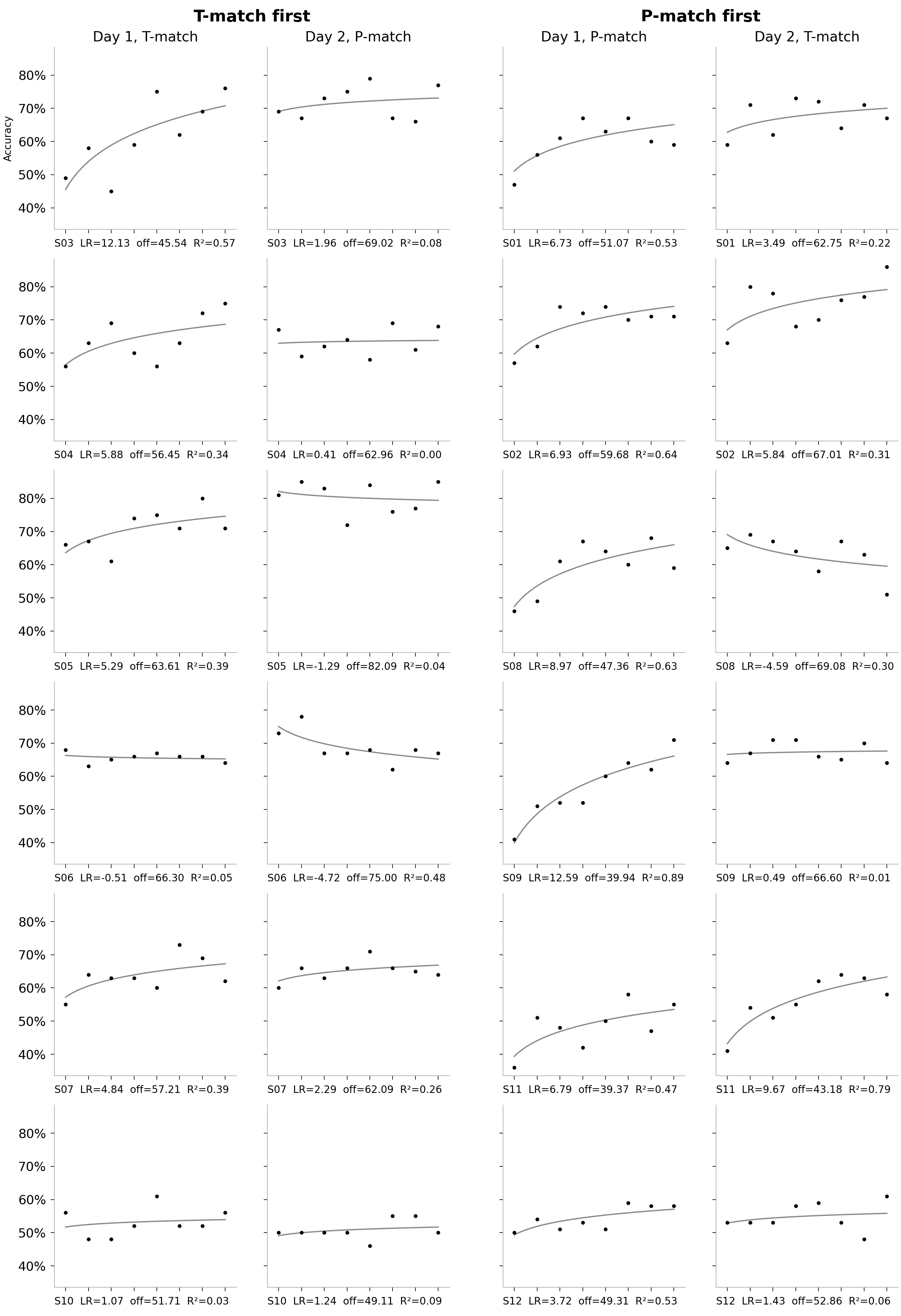
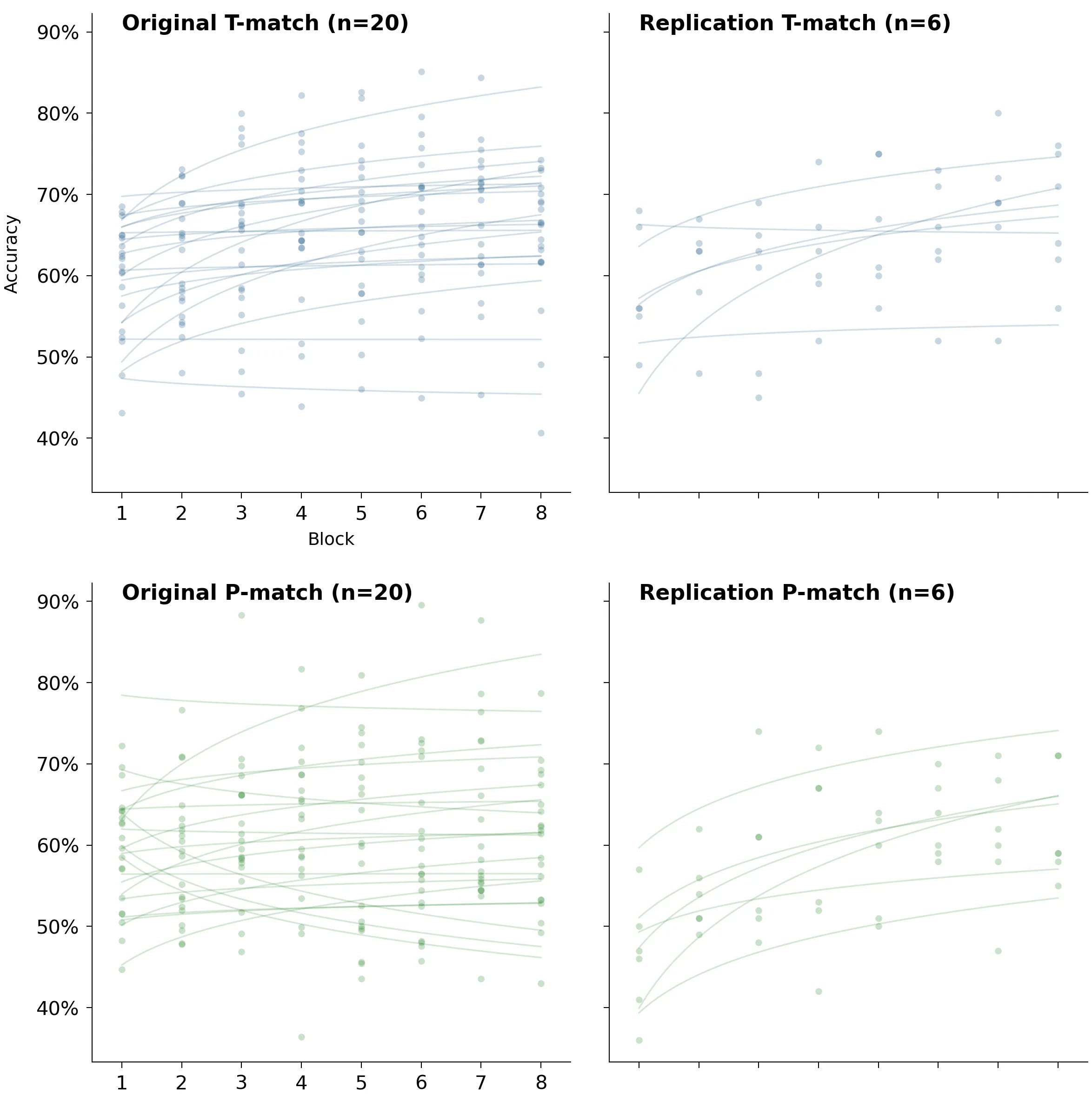
Replication: individual participants’ data
In the main section we haven’t shown the per-participant, per-block accuracies — the raw data driving the learning curve fits. Below you can see this data for the replication.
Original study: individual participants’ data
As for the original study… Some of the original data is published. The authors provide computed learning rates for the P-Match, T-Match, and T-nonMatch groups in the groupLR_forLMM.csv file — these were used to build charts in the main section. The data for the arrhythmic control group isn’t included.
The per-trial and per-block accuracy data is also not available, so we can’t directly rebuild their charts. But there is data that allows us to recompute a useful approximation.
They provide per-block accuracy data in the AccPerLat.csv file, with three rows for each participant corresponding to a delay of 1, 2, or 3 alpha cycles. On average, each participant should receive one-third of each latency, so averaging those accuracies gives us an overall per-block accuracy estimate.
This isn’t a perfect method — the average of an entire set is not the average of averages of three subsets. But it’s the best we can do if we want a glimpse of their original curves. I wish they had simply published the overall per-block accuracies, but alas.
How much does this method change the overall distribution of learning rates? Let’s compare learning rates, original vs. recomputed:
Visually, the distributions don’t seem to change much. Computing per-participant errors would be nice, but unfortunately, their CSV files don’t contain a key we could use to join.
Again, ideally we wouldn’t have to do this procedure — if the original authors release their full data, I’m happy to publish an update. For now, here are the approximations.
Looking with the naked eye, can you tell these conditions apart? The most striking difference is, again, the presence of large negative learning rates in the P-Match cohort.
Links to other comparisons: T-match vs T-NonMatch, T-match vs Arrhythmic Control, P-match vs Arrhythmic Control.
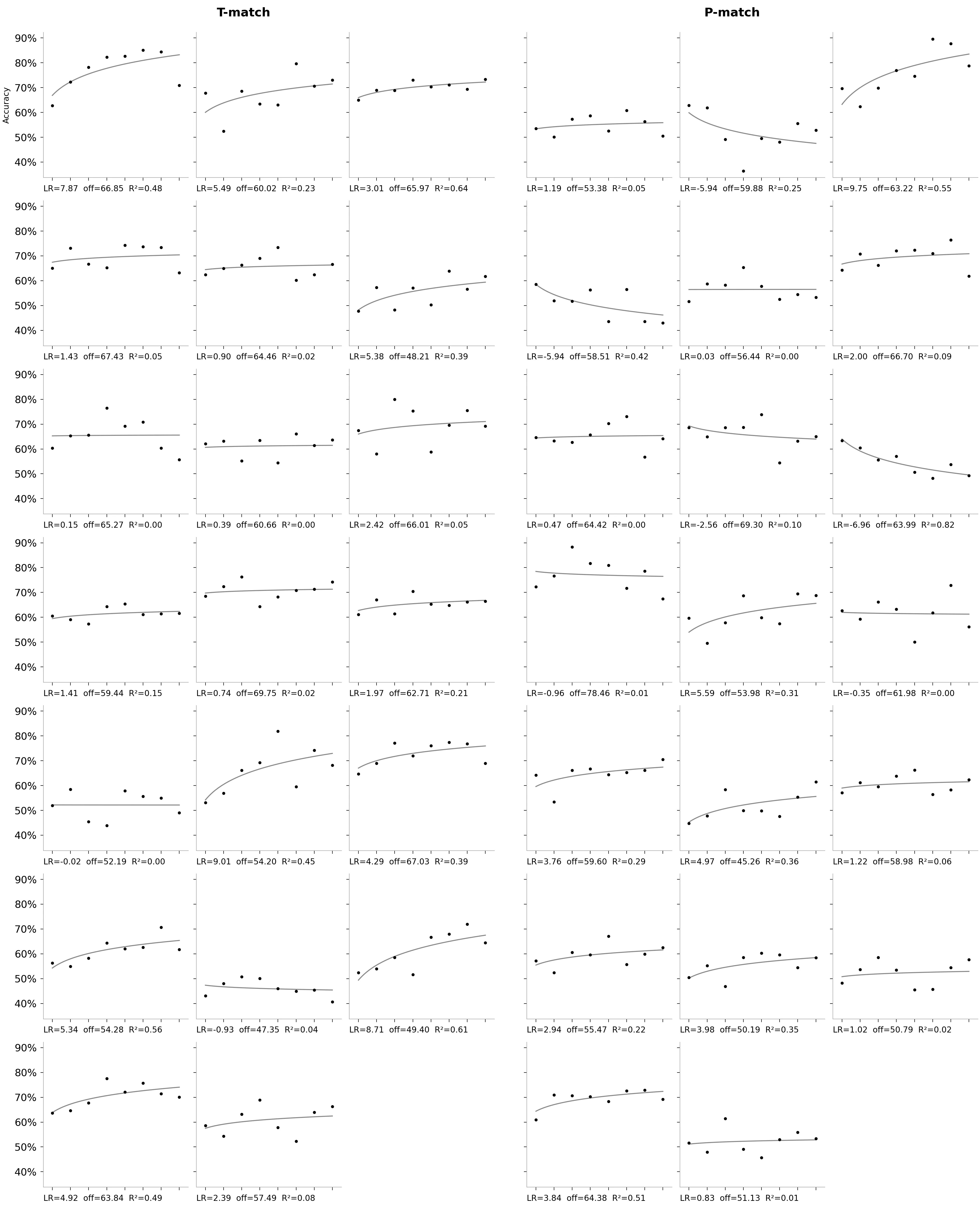
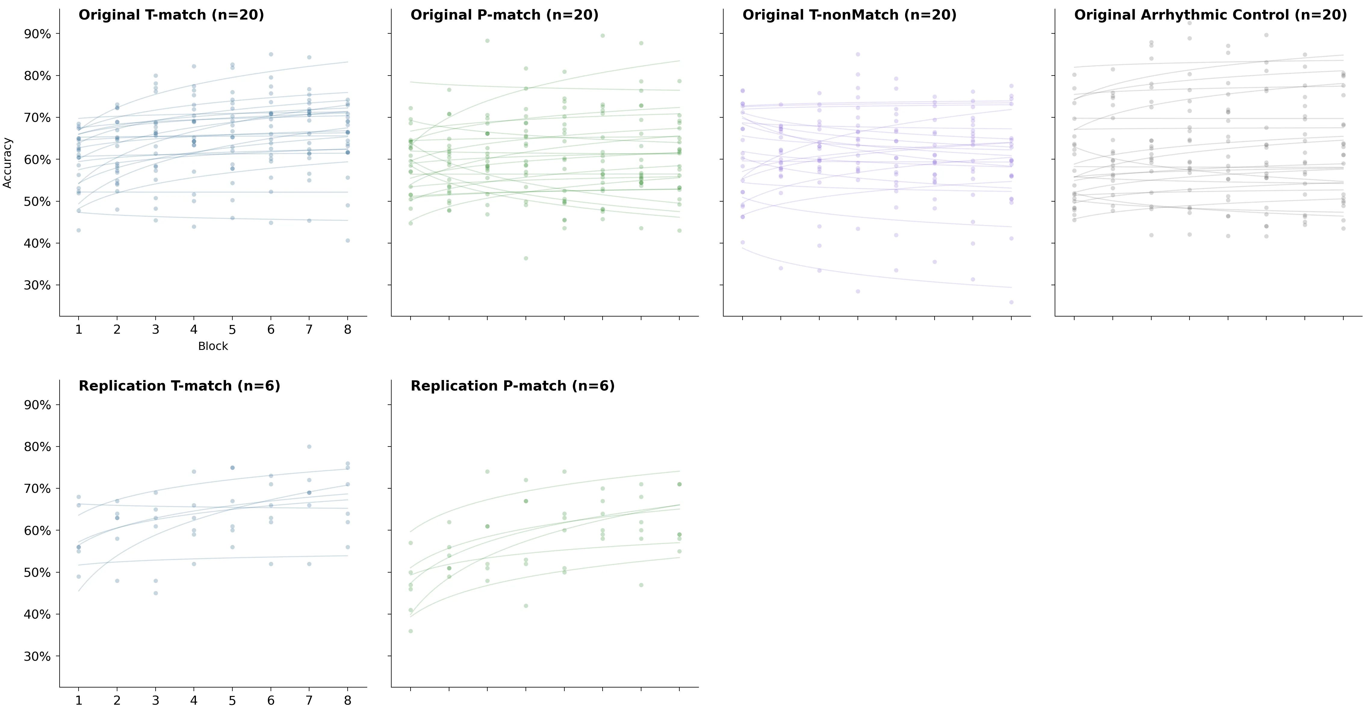
Spaghetti plots for all groups
These individual charts are hard to compare side by side. Here are the same per-block accuracies, meshed together with their fits, so patterns in the data are easier to spot. These charts also include the T-nonMatch and Arrhythmic Control groups.
Some interesting patterns:
There is a drop in accuracy in the original study on the last 8th block.
There are pretty high accuracies in the arrhythmic control for some blocks.
The arrhythmic control is the most spread out of all groups.
2×2 grid of spaghetti plots for T-match and P-match
The previous chart makes it easy to compare groups within each of the two studies. To make comparison between the replication and the original easier, here are the spaghetti plots for T-match and P-match arranged differently: conditions are now rows instead of columns.
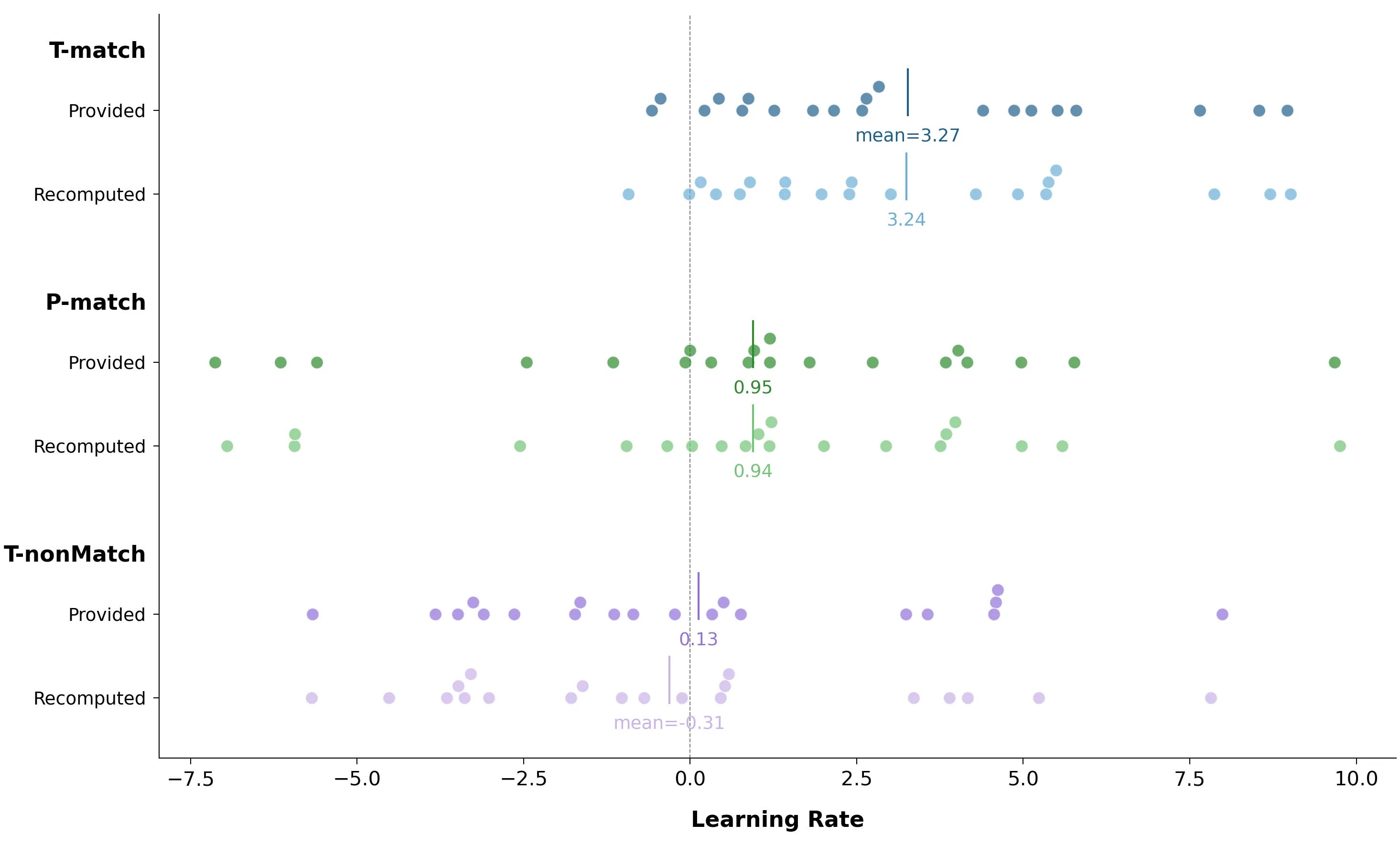
The original study: all of the learning rates together
Recovered per-block accuracies and their fits also let us see the full distribution of learning rates.
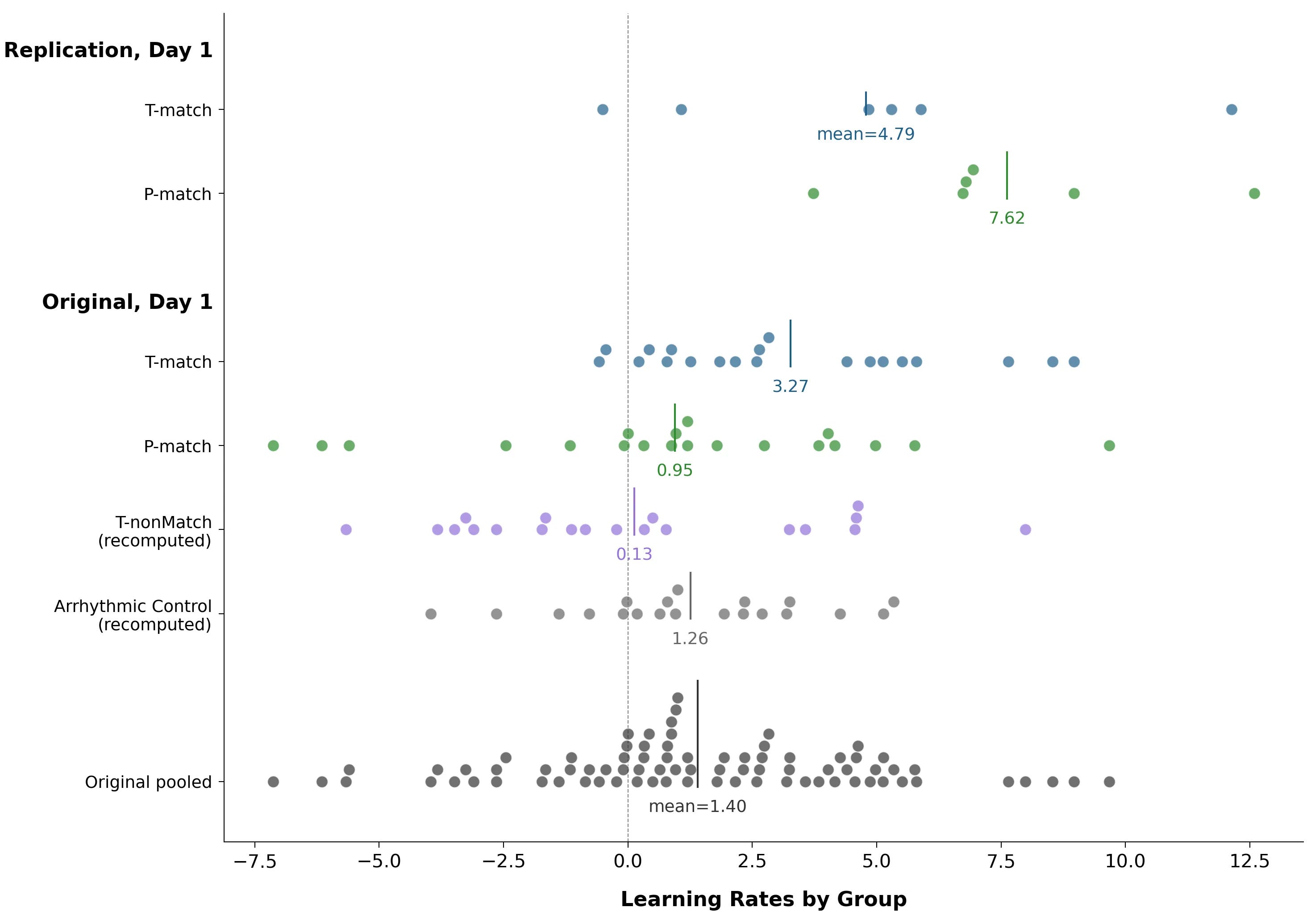
Two things stand out:
Somehow P-match got almost the entirety of the left tail of the full distribution.
Negative learning rates weren’t unusual at all.
Re-analysing the headline chart: excluding large negative learning rates
What happens if we exclude the large negative learning rates and recreate the headline aggregated learning rates chart? Let’s use a learning rate ≥ −1 as the cutoff to allow basically flat learning curves that are only slightly tilted downward.
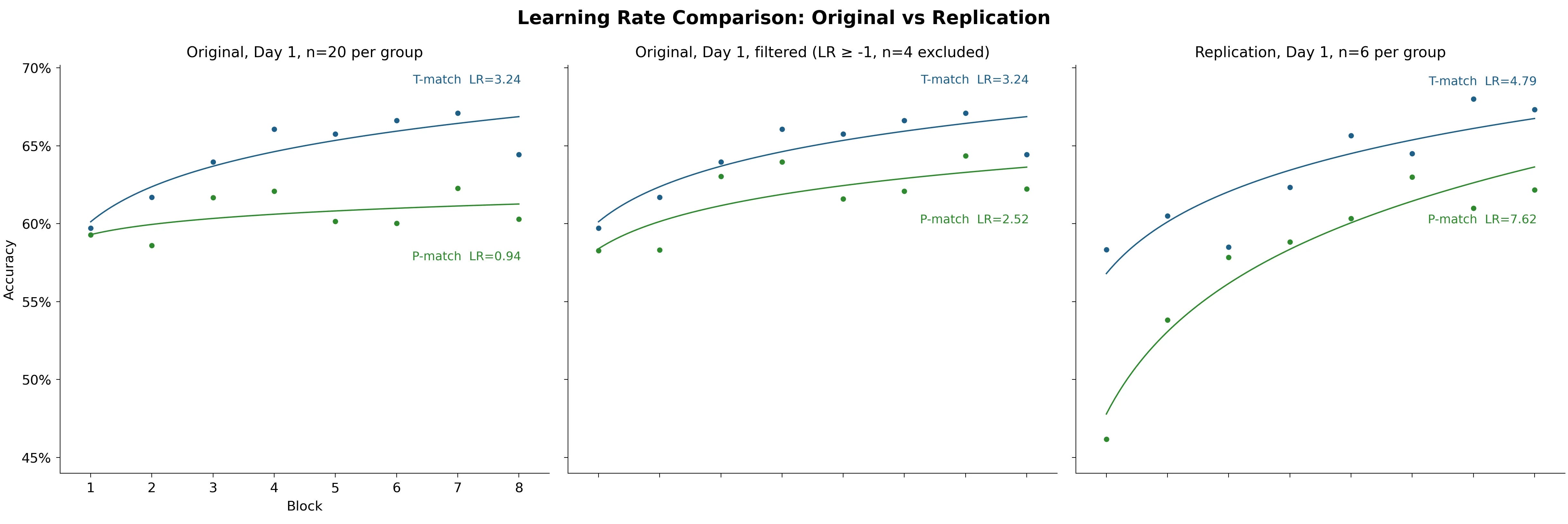
We end up excluding no one from the replication (min LR = −0.51 there) and four participants from the original study (all four in the P-match cohort).
The striking 3× difference vanishes. And the difference between T-match and P-match is no longer significant:
Student’s t-test: t(34) = 0.786, p = 0.4376
Welch’s t-test: t(33.0) = 0.791, p = 0.4346
Measuring alpha activity with an 1.5 orders of magnitude cheaper headset that had way less electrodes (8 vs 63)?
The electrode count is less of a big deal than it sounds. The original authors used only 5 channels at the back of the head to get peak individual alpha frequency (IAF). My headset had 3 channels there, so the difference in electrode count wasn’t that large. It’s still useful to record from 63 channels for more precise analysis later, but the core IAF estimation in the original study was done with a much smaller electrode subset.
As for price and quality, several people with extensive EEG experience told me an OpenBCI headset was reasonable for this replication. Before running my study, I emailed the original authors with some questions and mentioned the hardware. They didn’t explicitly comment on it, but they didn’t flag it as a bad idea either, and they told me they were looking forward to the results.
Additionally, the replication deviated from the original study in several important procedural ways — changes that hopefully helped with IAF precision.
How the peak alpha frequency is measured — and steps taken to make estimation more accurate in the replication
The alpha rhythm is the ongoing, roughly sinusoidal activity you see most clearly at the back of the head, occurring in the alpha range (defined as 8–12 Hz). It’s fairly regular but not a perfect metronome: its amplitude waxes and wanes, and its instantaneous frequency can drift over time. But it often has a dominant rate.
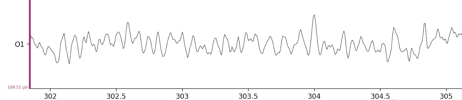
The chart above shows an EEG recording from one electrode of a participant in the replication, at around the 5-minute mark. There’s regular activity that looks quite periodic — this is the alpha rhythm, and it’s quite pronounced. But you aren’t seeing only the alpha rhythm; there’s other activity in the brain too. If you tried to estimate this participant’s frequency with the naked eye, you’d probably arrive at around ≈10 Hz, but you’d have to make some tricky decisions about what counts as a peak.
One important detail: the recording is also somewhat post-processed — frequencies below 1 Hz and above 40 Hz have been removed. To understand why, let’s take a look at the raw data below.
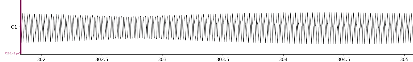
The electrical activity is entirely dominated by 50 Hz noise from the power grid. Note that the Y-scale difference between these two charts is almost 70×.
To account for all this, a power spectrum is computed from the recording after filtering. A power spectrum tells you how much of the signal lives at each frequency. The alpha activity shows up as a bump or peak in the alpha band (8–12 Hz in the study, 7–14 Hz in the replication). The individual peak alpha frequency (IAF) is defined as the frequency (in Hz) where alpha power is maximal.
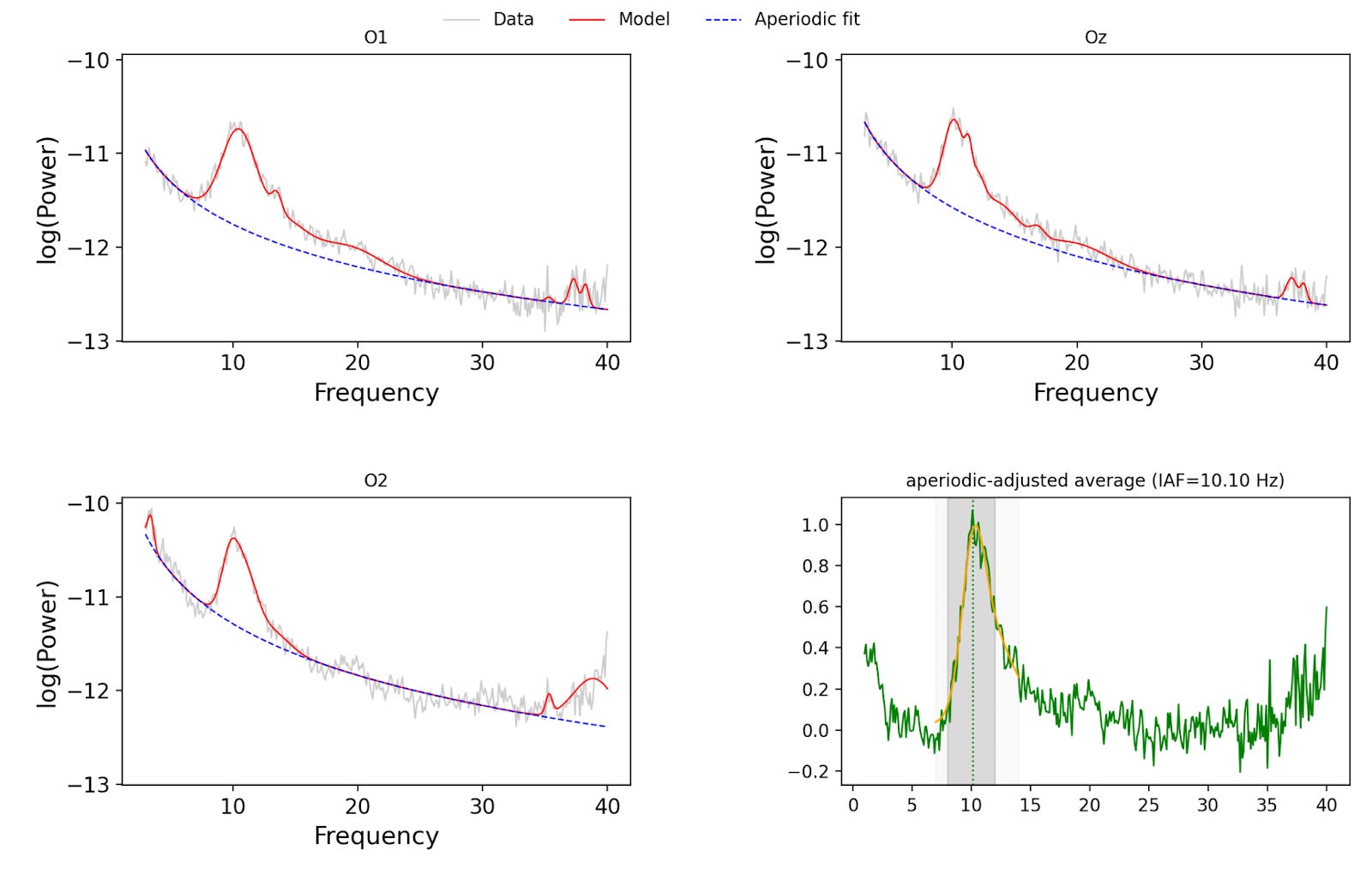
These are the charts from the replication for the same participant. You can see somewhat differently shaped curves on the three electrodes at the back of the head — O1, Oz, O2. In the original study, the authors averaged the spectra; in my replication, I fit a SpecParam model and then subtracted the aperiodic component before averaging. On a cheaper headset, one would expect the alpha peak to be less pronounced, so it makes sense to use a more sophisticated procedure to isolate the true oscillatory peak.
Additionally, EEG activity was recorded for 7.5 minutes instead of 5 — more data makes the peak stand out more against background activity.
The original authors don’t specify the conditions of their recording environment. I opted for a dark room (< 2 lux in the plane of the participants’ eyes), since alpha activity is more pronounced in the dark — further helping with IAF estimation.
Finally, as in the original study, participants stared at a screen with a fixation point. They were instructed to keep their eyes open, and the instructions allowed meditating with eyes open if participants knew how and wanted to — meditation is known to increase alpha power.
Other differences in handling EEG in the replication
This section is technical and intended for people familiar with EEG.
Pre-processing. I applied a 1–45 Hz bandpass filter but did not re-reference to the average — sticking with a hardware reference makes more sense with only 7 channels, since re-referencing would throw away a larger proportion of useful signal. The power spectra conversion should be the same; it was done using Python’s MNE library.
SpecParam quality control. SpecParam was also used for quality control of recordings. The parameters for automatic quality control were predefined; if a recording didn’t pass, a re-recording was initiated after refitting the headset. I used the EEG data from the first two participants to tune these parameters — they are excluded from the analysis (not part of the n = 12 sample). I didn’t unblind myself to participants’ conditions (T-match / P-match) when doing this.
Alpha band definition. The alpha band was widened from 8–12 Hz in the original study to 7–14 Hz in the replication. The reason: charts in the original paper suggested several participants had measurements at exactly 8 and 12 Hz, hinting that true peaks might’ve lied outside of the band.
Headset fitting. I’m not sure how the original authors fit their headset, but mine had dry electrodes and required a lot of trial and error. The procedure: get OpenBCI GUI to show a reasonably clean continuous real-time recording (staying within ±50 µV), then record and rely on SpecParam-based quality control to trigger re-recordings.
The OpenBCI headset can become quite uncomfortable (and often downright painful) over prolonged periods — the feeling is like wearing a shoe one or two sizes too small. Since the flicker frequency is set only once before all trials begin and never adjusted during the session, participants were allowed to request loosening of electrodes or full headset removal at any point. This was for the participants’ comfort — and to prevent the discomfort from interfering with the task performance.
For the full procedure read the pre-registration and the code (here is the specific commit that was used). Code takes priority over pre-registration.
Recruiting participants
Participants were recruited from the ACX blog, Scott Alexander posted updates like this one. They were also recruited from various WhatsApp group chats (e.g. ACX London, London Rational-ish), in person during meetups, and via word of mouth.
Dropouts
One person dropped out after the first day because of significant headset discomfort that led to a headache afterwards. Another dropped out during the first session, when fitting the headset took too long to complete within the scheduled time — they were offered the chance to come back on another day, but this didn’t work out due to a scheduling conflict. Neither was included in the final analysis.
Other important replication facts and differences
1. The original study had participants practise the pattern recognition task for 50 trials before recording EEG. The paper doesn’t make it clear whether feedback was provided during this practice (whereas nearby sentences describing other parts of the study explicitly mention feedback). I somehow missed that part of the study despite reading it dozens of times.
2. Breaks were allowed every 100 trials rather than every 200. This is fully intentional: I don’t know why they allowed breaks every 200 trials but used blocks of 100 as their unit of analysis — it makes even-numbered blocks systematically different from odd-numbered ones. It seemed reasonable to make both the same size.
3. After each 100 trials, a break screen was shown encouraging participants to take a break, and listing their per-block accuracy as a percentage. The latter was intentional, to help participants better calibrate on their overall accuracy. The task is repetitive, difficult, and frustrating — it’s easy to feel like you haven’t improved at all when in fact you’ve done quite well.
If participants raised concerns about not improving when they actually weren’t improving, I would provide some encouragement by repeating this part of the instructions: they should try to do the best they can, but it’s not an exam, and every kind of learning pattern is valuable.
4. The original study provided per-trial feedback in the form of a green check or a red cross for only 100 ms — likely to minimise the effect on the EEG. I provided feedback for longer, for the entire inter-trial interval (1.5 ± 0.25 s) plus those extra 100 ms. This was semi-intentional. I prototyped the first version of the trial runner with GPT-5, which showed feedback for the full inter-trial interval.
This seemed like a wise decision to me — any real-world learning system would show feedback this way. I noticed the discrepancy with the original study very close to running the replication, after already doing extensive testing on myself, and decided not to change it. No regrets — this brings the system closer to real-world conditions.
As for potential EEG data analysis: I was already running a replication on a cheaper headset that allowed participants to remove it mid-session. A further small drop in EEG data quality seemed acceptable, given that the EEG was not used for the initial IAF measurement during these trials.
The perceptual boost
Although we found similar learning rates in both groups, our study showed a small but significant overall advantage for the T-match group that wasn’t present in the original study. Why?
Again, one possibility is coincidence. Are there others?
I had a better monitor than the original authors over some dimensions. They used a monitor with a fixed 120 Hz refresh rate, whereas we used one with a variable refresh rate (48–165 Hz) that dynamically adjusts to the frequency of frames being output.
On a 120 Hz monitor, frames follow with a constant inter-frame interval. This means you cannot physically produce uniform flicker at all frequencies. For example, although 10 Hz flicker is easy (just have 1 frame bright and 11 frames dark), 11 Hz flicker is more complicated (120 is not evenly divisible by 11). Your options are:
Sacrifice uniformity of the flicker. Sometimes you have 10 “off” frames between “on” ones and sometimes 9.
Pick the nearest evenly divisible frequency. For 11 Hz, the two closest options are 10.91 Hz (1 frame on, 10 off) and 12 Hz (1 frame on, 9 off).
The authors don’t report which strategy they chose. They simply write: “Although the 120 Hz refresh rate may limit the presentation rate, validation analyses suggest that the neural response targeted effectively the desired frequency.” My guess is that they didn’t choose either strategy in a principled way. If you’re writing code “hoping for the best” without thinking about this, you can end up with either (1) or (2) depending on how your code is structured. The physical reality of a fixed refresh rate monitor picks the strategy for you.
It’s more likely that their strategy is (1) — this is what you get if you’re writing code in the easiest, most straightforward fashion.
But it’s still possible they ended up with (2). This is less likely, because you’d be forced to think about the actual flicker rate (and thus properly report it). Still, there are ways to structure code where you end up with this strategy by accident (e.g. reusing code from a previous project without reviewing it).
The authors write: “We predicted that individualized alpha entrainment targeting the trough phase for stimulus delivery would boost learning, based on previous work showing that the trough phase of alpha oscillations is associated with stronger disinhibition (Busch et al. 2009; Mathewson et al. 2011, 2010; Fakche et al. 2022) that may facilitate visual target detection from clutter.” And perhaps with a better flicker and better timing of patterns, the replication ended up with P-match incurring a higher penalty — and a more striking difference between T-match and P-match. 1/120 Hz ≈ 8.3 ms is not nothing, it’s 7–10% of an alpha cycle. Or perhaps the replication was better at tailoring the entrainment to participants’ peak alpha frequency.
 | A guest post by
|