


Your Review: Islamic Geometric Patterns In The Metropolitan Museum Of Art
Finalist #4 in the Review Contest
[This is one of the finalists in the 2025 review contest, written by an ACX reader who will remain anonymous until after voting is done. I’ll be posting about one of these a week for several months. When you’ve read them all, I’ll ask you to vote for a favorite, so remember which ones you liked]
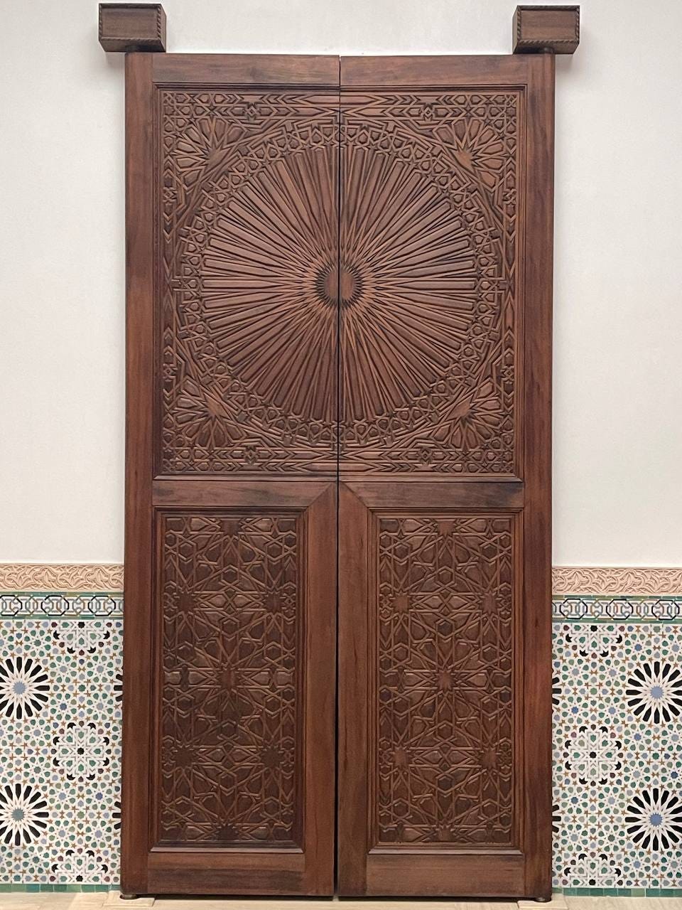
Gallery 456, also known as The Moroccan Court, was built in 2011 during the most recent renovation of the museum’s Islamic arts wing. Seeking to showcase not just Islamic artifacts, but also the cultural continuity of the art forms themselves, the museum commissioned a team of Moroccan artisans to build a 14th-century style Maghrebi-Andalusian courtyard on-site. Historical artifacts were interwoven with new creations, produced using historically accurate methods including hand-cut zellij tilework, carved cedar moldings, and filigreed plaster. Among these new creations were also the wooden doors shown above, which appear to mimic the style of grand portals found in madrasas.

Curiously, after finally visiting the Islamic arts wing of The Met earlier this year, I noticed that the geometric designs on these doors are rather imperfect.
The aim of the project was to create an architectural centerpiece that could be experienced much like a traditional Islamic home or mosque. As such, the finished gallery includes no labels beside the objects on display. Instead, an interactive display nearby explains the concept and construction of The Moroccan Court. In these notes the curators lavish praise on the wall tile patterns and the arches but said little about the doors, so I had to make some educated guesses about their provenance and design. In the end, I believe these are made by the same team that made the highlighted zellij and arches, but there are genuine blunders in their execution here. I would like to explain why I think so and share some broader insights one might gain from such an exercise.
The Familiar Unfamiliarity
If I were to take a guess, Islamic geometric patterns, like many forms of decorative art, probably occupy a vague and under-defined space in most people’s minds. Up until a few years ago, if someone had asked me to describe them, I probably could have listed a few general features but definitely would have been unable to create an example. Further, if presented with several patterns, some expertly executed and some not so much, I likely would have struggled to distinguish the masterful from the amateurish. This is perhaps not unlike how people have difficulty picking out the correct double storey “g” from a lineup. In general, we enjoy decorations, but we don’t think too deeply about them, and we can’t always tell the excellent from the good, or the good from the mediocre.
That said, Islamic geometric patterns as a genre are quite distinguishable from other decorative traditions. These designs incorporate, or at least imply, both translational symmetry (such that a section of the design can be repeated to fill the plane) and point symmetries (exhibited by complex star- or flower-like patterns clustered around various foci). They feature interlocking or interlacing lines that suggest an infinitely continuing weave, as if executed by a meticulous yet imaginative artisan who knows precisely where to bend and twist the threads to surprise you at every turn.
Such creations clearly can’t be arbitrary. In fact, a few conventions are generally observed for a design to be recognized as part of the genre. Skilled artists, of course, break these rules to create novel patterns or to address specific contextual demands. However, disregarding them haphazardly risks producing designs that appear incoherent and amateurish.
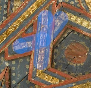
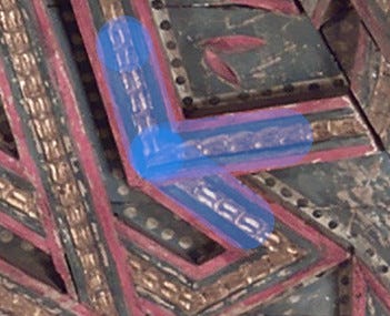
To pare it down to the essentials, the first few rules all serve to maintain the impression that the designs are formed by interweaving lines that either extend infinitely or connect into loops. First, lines should never terminate except at the boundary of the entire design. In practice, inexperienced artists often violate this rule by allowing lines to end at intersections, creating T-shaped junctions. Second, lines must maintain their direction before and after crossing another line. In other words, lines should not change direction at an intersection point. This issue commonly arises when a designer copies elements from existing pieces that do not align properly due to mismatched orientations or incompatible angles. They may attempt to fill in the gaps by improvising the connective tissue but end up losing the tussle against geometry. Third, within a single design, lines should only turn or intersect at a limited set of compatible angles. These angles are usually derived from a basic “seed” angle by taking its complement, doubling it, halving it, or combining angles together. This ensures that any pair of line segments will either be parallel or form a few fixed angles, establishing a harmonious geometric relationship between them and an orderly aesthetic.
The second set of rules addresses the framing and scaling of geometric patterns. The complexity of a pattern should suit the size of the surface that it covers: intricate designs should not be used on small areas, nor should large areas be tiled with overly simple patterns. The latter is a more common issue in modern attempts. Another convention holds that when a design features large star-like elements, the border of the design should align with the centers of these stars, with the corners of the canvas also coinciding with the centers of the stars. This ensures that even incomplete elements at the edges and corners retain as much rotational symmetry as possible, avoiding distorted or asymmetric shapes that only appear along the boundary.
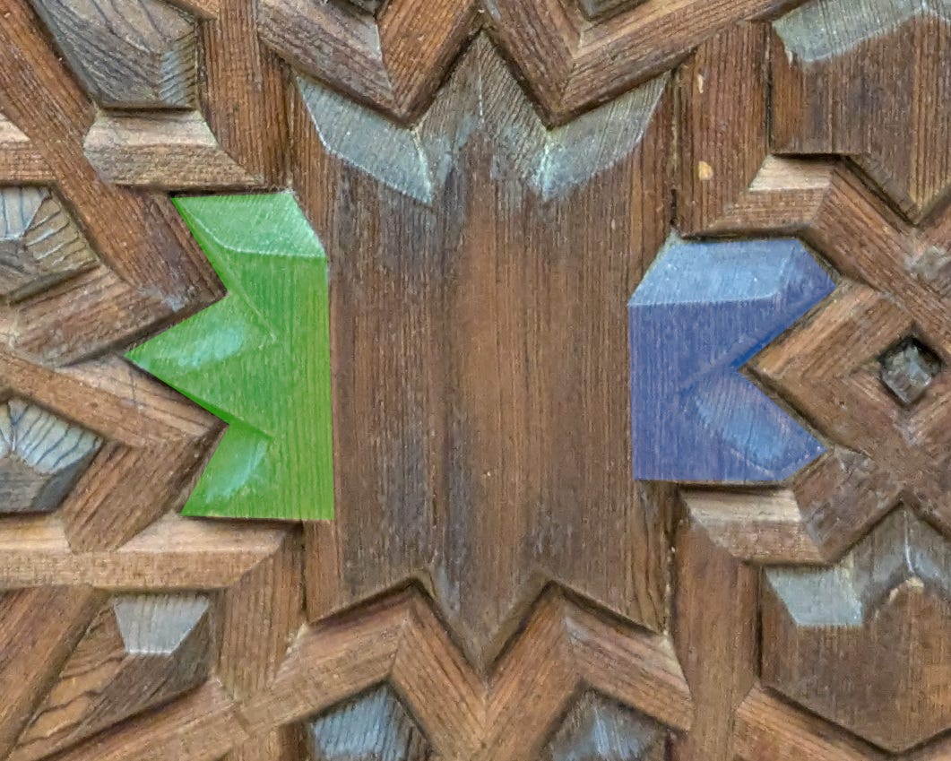
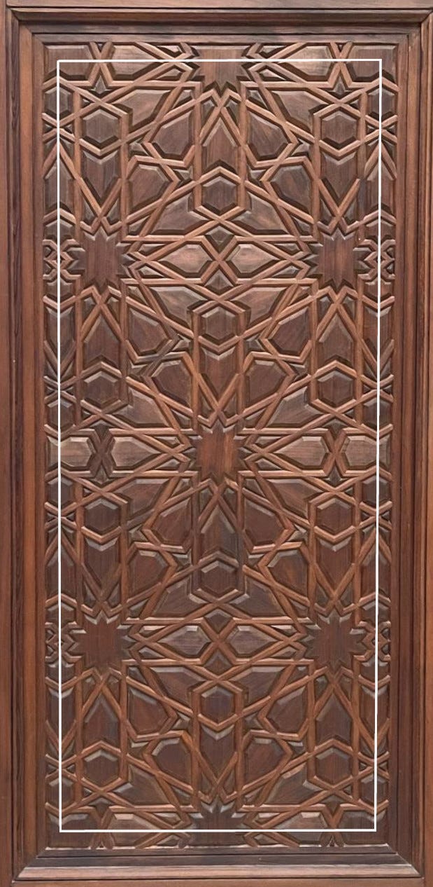
In case it isn’t already apparent, the examples of rule violations mentioned above are all from the Metropolitan Museum. Specifically, the above figures are from the lower panels of the doors in The Moroccan court, and previous two examples are from a set of ceiling panels overlooking Ottoman carpets and armors in Gallery 459.
How (not) to fake it
Interestingly, when artists untrained in the methods of constructing Islamic geometric patterns make the mistakes mentioned above, they often fall into the same failure mode. A large number of geometric patterns have been extracted from historical examples and published in various collections, making it easy for a modern designer to look them up and reuse them. They typically recognize that these patterns can be generated by repeating a small unit, like wallpaper. Thus, when they find a design they like, they may cut out a portion and tile their canvas with it. However, the tiling unit they choose often does not correspond to the actual repeating unit, resulting in awkward seams where mismatched lines join at incongruous angles and form undesirable shapes. Even when the correct tile is used, the designer might fail to fit the region precisely. As a result, some may simply stretch the pattern, destroying the point symmetries in the process. Others allow the patterns to be cut off mid-design. A more conscientious artist might try to fill in the gaps manually if the tiles fall short of the boundaries. However, without knowledge of construction methods or an understanding of the constraints outlined earlier, they often extend the patterns in ways that produce incorrect joints, asymmetric shapes, or awkward bends.
I don’t want to accuse the creators of the Met’s door panels of falling into these traps, since by all accounts they are skilled artisans, trained in an unbroken tradition and fully aware of what they’re doing, while I’m just a nerd. But the issue remains: the alterations there created terminating lines and asymmetry where continuing lines and symmetry are expected.
Notably, on this set of doors, the rails and stiles around the geometric design are of roughly equal widths on all sides, which might seem like an obvious choice. However, an artist sticking to the norms of the geometric design would instead accept the compromise of padding around the pattern, sacrificing up the equalness of the frame for the harmony of the design — an approach exemplified by the following minbar doors from 14th century Cairo, also in the Met’s collection.

One possible explanation is that, maybe these “mistakes” are simply common compromises made routinely, even in well-regarded examples of geometric patterns. After all, some of the instances I cited above clearly came from historical objects. The ceiling in Gallery 459 is clearly weathered, faded, and museum-worthy.

This ceiling has an interesting provenance. It dates to 16th century Spain. The Met describes it “a testament to the resilience and persistence of traditional Islamic design in Andalusia after the Christian Reconquista”. Its “somewhat uneven geometric pattern” is explained as the result of an adaptation from a smaller piece designed for a smaller and more symmetric space, so compromises had to be made.

However, in my view, these broken lines signal a break in the tradition. To be fair, this particular design is a difficult one to adapt. The non-planar surface is inherently challenging to work with, and the original artist made the bold choice of combining nine- and twelve-fold stars on an octagonal ceiling. Stretching and patching together such a design was never going to be easy. But the artisans responsible for the adaptation either did not know or did not care about the aesthetic norms of geometric patterns, as the centerpiece of the ceiling fails even to preserve mirror symmetry. It’s also somewhat amusing to consider that the patron likely didn’t mind or even notice the discordant details.
Although admittedly I have not combed through the Met’s collection exhaustively, aside from these two examples — one recent, the other from a milieu that had just suffered a major political and cultural disruption — I have not personally found other obvious instances of wonky geometric patterns. Thus, I’m inclined to believe that the norms are robust, and the deviations are aberrations.
How to make it
I have criticized the wrong methods — copy-and-paste and ad-hoc invention — for creating Islamic geometric patterns, along with the unfortunate results they can produce. Yet even copying relies on the original invention of patterns, which presumably used the proper techniques. So what are those proper techniques?
Serendipitously, they are illustrated explicitly in the following jali, or perforated stone screen, from the Mughal empire, also on display at The Metropolitan Museum.
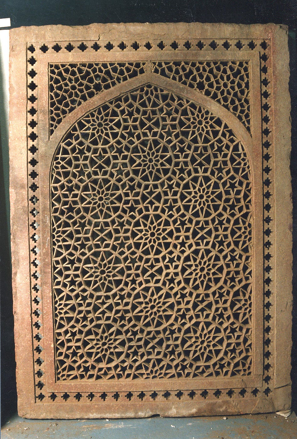
Notice that this screen actually breaks one of the key rules listed in the first section — there are numerous three-branch junctions. Setting that aside for the moment, a closer look reveals two distinct types of lines in the design: the first is slightly thicker and protrudes higher, while the second is thinner and slightly recessed, extending and weaving in a (mostly) typical fashion.
The rule-breaking is partly justified by the jali’s material and function. Viewed from indoors against sunlight, the openwork window would appear as a web of shadows. Under such conditions, the fine details needed to create an interlacing effect are difficult to discern and could also compromise the structural integrity of the stone. Therefore, the artist is justified in omitting interlacing altogether. Without interlacing, the “no T-junction” rule need not be strictly enforced, except for aesthetic purposes. Additional lines that create T-junctions may be added as long as they harmonize with the overall design. The thick protruding lines in the jali play this role.
A keen observer will also notice that these thick lines enclose three polygonal shapes that tile the area, as illustrated below. This turns out to be a hint at how most Islamic geometric patterns are constructed.


Now let’s look at the thin pattern lines. Within the boundaries of each polygon, the most noticeable shapes are probably the five-pointed stars in each pentagon. A closer look will reveal pairs of larger five-pointed stars inscribed in the decagons as well — one pointing upward, the other downward. These highly symmetric geometric figures make the design visually fun to look at.
However, I want to draw attention to the fact that all these shapes share the same vertex angle of 36 degrees, with their vertices positioned at the midpoints of the polygon edges. This holds true even for the non-regular hexagons, which enclose pairs of swift shapes rather than stars. Zooming in on the edges, we observe that two pattern lines meet at the midpoint of each edge, each forming a fixed angle of 72 degrees with it. As a result, when any pair of these polygonal tiles are lined up edge-to-edge, we can trace the pattern lines within one tile to the edge, where they intersect and continue seamlessly, without bending or breaking, into the neighboring tile.

From the above observations, we have discovered a method of construction. Begin with a set of polygonal tiles that can tile the plane. Choose a seed angle. From the midpoint of each edge of every tile, draw symmetric pattern lines. These lines must be symmetric around the midpoint and form the chosen angle. When a pattern line originating from one edge intersects a pattern line from a neighboring edge, terminate both lines so that they form a single, continuous line. This line will appear to enter the tile at the midpoint of one edge, turn in a new direction, and exit through the midpoint of another edge. Finally, tile the plane with these completed polygonal tiles. As if by magic, the pattern lines will connect into a geometric pattern that perfectly adheres to the rules of line arrangement.
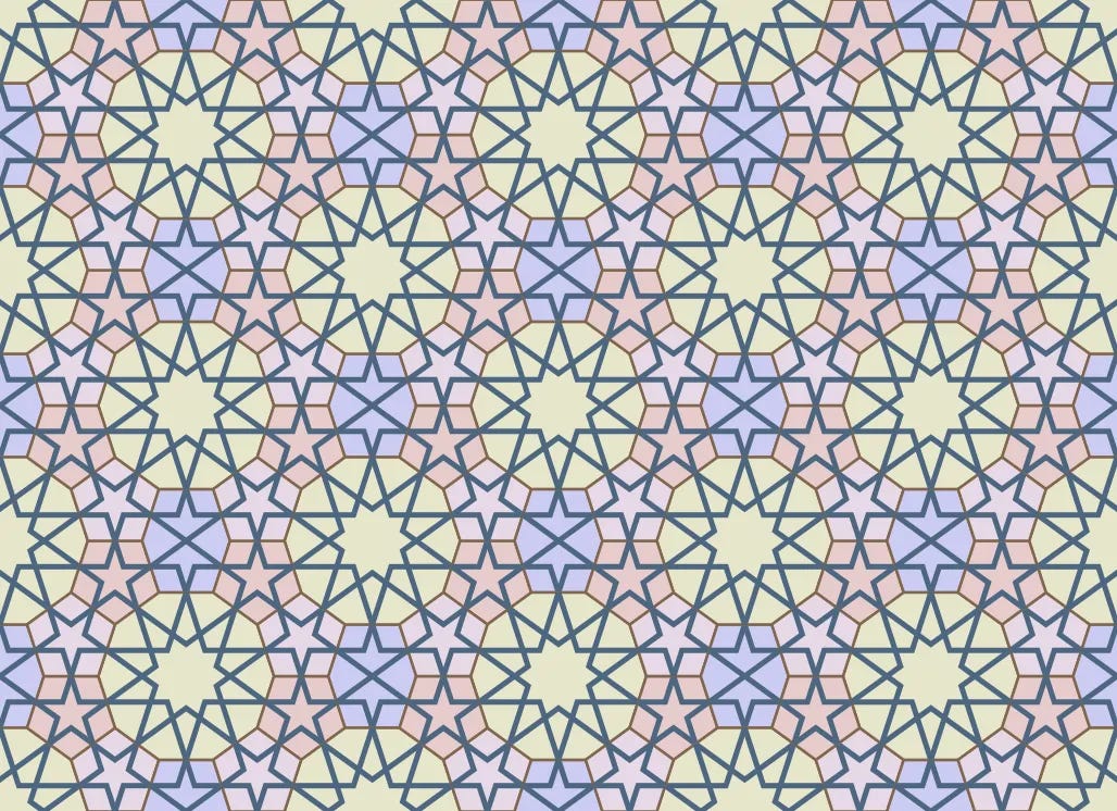
This pattern is based on one set of polygonal tiles and a specific arrangement of them. There are many families of such tiles based on regular polygons, helpfully classified by Jay Bonner and Craig Kaplan in their tome Islamic Geometric Patterns according to the order of rotational symmetry of the largest regular polygon in the set. Additionally, there are numerous ways to fill the plane with these tiles (some examples of regular polygonal tilings can be found here). Given a set of polygonal tiles, various — though not arbitrary — seed angles can be chosen. The choices of tiling and seed angles have the strongest influence on the resulting pattern. An experienced artist can intuitively select the appropriate tiling scheme and seed angle to suit their intentions without needing to plot out the entire design.


While the process described so far may seem systematic and rigid, there are also non-systematic aspects that greatly increase the variety. For example, observant readers may have noticed that the pattern lines in the decagonal tile don’t strictly follow from the method described so far. To achieve the nested star shape, the pattern lines emanating from the edges are extended until they intersect with a second line. This adjustment enhances visual appeal in the largest and most prominent tile in the design. It also balances the density of pattern lines, preventing a large open space from appearing in the center of the decagons.
The special treatment of high-symmetry points is far from the only variation. One major alternative is non-systematic designs that only approximate regular polygonal tilings. These are much more difficult to create. Allow me to demonstrate with one of my own attempts and the sketch that helped me figure out the tiling. The top half of the double door in the Moroccan Court, featuring a large central element with 40-fold symmetry, would have also required non-systematic methods.


Still, it is possible to create new and interesting designs by remixing existing patterns or introducing geometric elements that might ordinarily seem incongruous. A beautiful example of this approach can actually be found in the Moroccan Court in the wall zellij.
In the “making-of” video created by The Met, they explained their intention to adapt a design from the Alhambra to suit the Moroccan context they aimed to create. The design process was challenging, described by the curator as a medieval ordeal, involving cutting and pasting figures traced on paper with scissors and even plotting directly on the walls, as the designs were too complex and constrained for computer design software to handle effectively. This is just an educated guess, but I surmise that the main difficulty is that the original Alhambra design was for a panel shorter than this one, so the design had to be scaled up somehow. Simply stretching design would look too crude since the component tiles would be very large, while tiling the design multiple times would look monotonous. In the end, they did some clever cutting and pasting, and made it work.
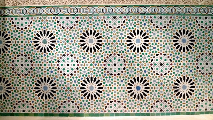
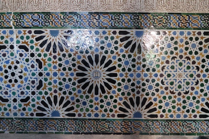
The original Alhambra design was dominated by stars with 16-fold symmetry (I’ll call them daisies), lining the edges and alternating with another type of star in the middle row. The Met’s adaptation incorporates more square-tipped stars (I’ll call them zinnias). Substituting one star for the other is not particularly difficult in this case, because both stars are the same size and fit in the same surroundings. This substitution created some unexpected effects. The zinnias have lower symmetry (8-fold) than the daisies (16-fold). As a result, the double lines in each petal create cross shapes that emphasize the vertical, horizontal, and 45 degree axes. This visually reinforces the placement of daisies on a square grid. The denser white tiles in the zinnias also makes the wall brighter overall, enhancing the illusion that this indoor space might be an outdoor courtyard.
The hyperreality
Umberto Eco’s famous essay Travels in Hyperreality about “America’s obsession with simulacra and counterfeit reality”, says this about museums that amalgamate the fake and the authentic: “This brings us to the theme of the Last Beach, the apocalyptic philosophy that more or less explicitly rules these reconstructions: Europe is declining into barbarism and something has to be saved.” The whole essay is a heady mix of wry travelogues and erudite alarmism, which I had a hard time fully understanding (or deciding if it’s cool to quote in this day and age), but this visit to the Met actually kind of made me get it.
The Moroccan Court is intended as a magical space. Visitors step through lacy pink stucco arches into a lively courtyard, complete with a gently bubbling fountain and vibrant wall panels. The colorful designs carve out flower-like patterns in dark tones, evoking an airy, shaded retreat just beyond the walls. There are no explanatory signs for each object — you are meant to experience them on immediate, non-verbal terms.
At the center of one wall stands a set of large wooden double doors, perhaps inspired by the entrance to a study in a madrasa in Fez. Being in an art museum, you wouldn’t attempt to open them, knowing better than to touch the artwork. But it is clear in any case that these doors don’t lead anywhere, and at that moment, you see through the illusion. You probably won’t even notice the flaw in the geometric pattern on the doors, but I think it hints at why the illusion ultimately falls short.
Museums often create spaces similar to the Moroccan Court in their galleries. Most often they consist of an array of furniture and decorative objects from a particular period and region, arranged to approximate a bedroom, drawing room, or study. Visitors are encouraged to engage with the objects individually, aided by laminated diagrams naming each piece along with its origin and date. Walking through such a gallery, you are invited to immerse yourself in the atmosphere, but the display remains largely informative and functional. There are interstitial objects that may initially seem authentic, but visitors are unlikely to feel disappointed upon learning otherwise, as the authenticity of the space is secondary to the authenticity of the objects. The setting simply illustrates where a card table might be placed and how vases and statuettes would be arranged on the mantel. There is no need to believe that someone once lived here, where every detail was planned according to their taste and needs.
Alternatively, the museum might reconstruct or relocate an entire room, using original objects in their original positions. In this case, the room itself becomes fully authentic, and visitors are encouraged to take it in as a whole. The Met’s Damascus Room is in fact such a space — a genuine and complete slice of late Ottoman Syria relocated to New York. Standing at the threshold (you are fenced out of the room by acrylic barriers, as the floor tiles are part of the exhibit), you admire it from a respectful distance, but are nevertheless invited into an experience that feels wholly foreign in space and time.
The Moroccan Court is similar to the Damascus Room in that you are asked to believe you are somewhere else. However, unlike the Damascus Room, the Moroccan Court had no prior existence before it was installed here. There is no specific Moroccan Court being recreated; the space functions as a hallway connecting galleries, with glass display cases visible on either side. The logic of a true courtyard does not actually apply — there can’t realistically be a study on the other side of the heavy double doors, the stuccoed arches need not blend with similarly ornate walls, and the floor is not tiled in the same scheme as the walls. The Met sought to capture a living, thriving artistic tradition in this space, but I don’t think they quite succeeded. It is neither a true spacetime capsule, like the Damascus Room, nor a typical immersive gallery, which alerts the visitor of its informational nature. Instead, it is an amalgam of creations from that tradition, attempting to convince you of the authenticity of the space through a sleight of hand.
So I think there is another story to be told here. Instead of a triumphant narrative of continuation, there is a quieter story of loss.
As a historical benchmark for the loss of ancient cultural treasures, people like to point to the Library of Alexandria. But historians have largely debunked the idea that Caesar, Saladin, or the Mongols set fire to it. Instead, I’m reminded of a Chinese emperor of the southern Liang dynasty in the mid 500s. In his early years, one of his older brothers — an eminent literati like himself — composed an eloquent letter lamenting the literary trends of the day. Anthropomorphizing rather gratuitously, he decried the corruption of good style by his contemporaries: “Were it not for its muteness, could the sooty ink be compelled by their brushes to stain? Were it not for its senselessness, could the reams of paper suffer their hands to flutter and crimp at will? Terrible is the sweeping inundation of letters — how has it come to this!” Years later, when the empire was in dire straits, the younger brother had the crown thrusted upon him. Eventually, with the capital besieged with no hope of rescue, he set fire to the hundreds of thousands of volumes in the imperial library, declaring, “The way of letters and the virtue of arms both shall come to an end tonight!”
Besides the dark irony — as if he took his brother’s disdain for “the sweeping inundation of letters” to heart and sent every piece of paper up in flames — I am captivated by the fact that this anecdote and the early communication between the princes survive, in such perfect dramatic contrast. While the veracity of such episodes can be debated, it seems fair to say people are drawn to these stories of spectacular loss, which in a way become stand-ins for the lost cultural treasures themselves.
But the Library of Alexandria wasn’t destroyed in a great conflagration. It gradually lost patronage, suffered from political instability, declined in prestige compared to rival institutions, and eventually met its end in obscurity. In the same way, the loss of an art tradition is rarely dramatic. Most of the time, no stories are left behind.
However, if you see through the sleight of hand of the “living” courtyard, if you notice the untidy lines and asymmetric patterns, maybe you will be reminded of the tangible process of making art. Then you might look deeper, past the interlocking tiles and vibrant glazes, to glimpse the invisible polygonal grids and pattern lines beneath, and use them as guides to feel the rhythm and rhyme of this individual artwork as well as the history behind it. In that way, those frayed edges are not merely shorthands for loss — they are seeds, quietly waiting to resprout in you.
Epilogue: Lingering thoughts
The method I described of constructing Islamic geometric patterns, called the polygonal technique by Jay Bonner, accounts for most of the variation in bare-bones geometric form, that is, how the lines are placed, where they turn, and where they intersect. But of course, there is a lot more to a finished piece.
Even at the pictorial level, choices must be made about how to develop the lines. The pattern lines might be thickened, interlaced, or erased and relegated to the background to serve as borders of mini-tiles. The choice of color and material plays a crucial role in shaping the character of a piece: it dictates how the patterns are rendered and reflects regional tastes. For example, simple wood panels often favor interlaced patterns, since intersections accentuated by carved wood trims can generate visual interest through contrasting profiles, even in absence of vibrant colors. Among the examples discussed above, jalis are typically Indian, while zellij is quintessentially Andalusian-Moroccan. Additionally, many geometric designs are augmented by other forms of ornamentation, such as calligraphy and arabesque. So I want to acknowledge that the actual practice of Islamic decorative arts is much more complex than I’ve suggested so far, and I certainly don’t mean to belittle the craft of the artists who built the Moroccan court.
To the extent that I’ve been able to create or replicate some of these patterns, the process reminds me of procedurally generated art — not the kind generated by stable diffusion, but the old school kind, generated by explicitly specified algorithms, autonomous systems, or the manipulation of randomness. As I understand it, there is often an experimental component: the artist begins with a vision, cooks up procedures, sees what comes out, then iterates, refining the method or sampling new random outputs with different seeds.
What makes my experience of making Islamic geometric patterns feel akin to generative art is the evolution of the gap between the stylistic expectation of an uninformed observer and its evaluation by a creator who understands the creative process. Approaching these designs as a layperson, it’s not difficult to identify surface features: unterminating pattern lines, translation symmetry, regions of high rotational symmetry, rendering techniques like widening, shadowing, and interlacing. But this kind of description is underspecified and unprincipled. They don’t pin down the artform enough for you to create new pieces. And when I see a laundry list of rules that say “usually people don’t do this or that”, I start wondering why it must be this, not that.
Learning the process and working through it answers many of those questions. Yet it also reopens others, on the other end of the creative process. The mathematical specifications serving as input are divorced from the visual results, and the experience of creation shifts one’s priorities. Thus, the evaluation made by a creator becomes different from the expectation of an onlooker.


Not all patterns following the polygonal method are considered “acceptable”. Some produce unevenly sized shapes, others create long, straight lines that introduce excessive uniformity. These effects can be predictable or surprising, so experimentation becomes integral to the process. In this iterative exploration, the artistic mind learns more and more of the latent space of the generative system, and eventually the gap between the expectation and evaluation effectively closes. Curiously, that is the moment when I feel the process stops feeling artistic.
Experimenting with decoration made this clear to me. For what it’s worth, decorative arts have a small latent space. The framework that classifies Islamic geometric patterns by tilings and seed angles boils it down to two discrete dimensions. That is miniscule complexity. As a result, very quickly I felt that I grokked the systematic patterns (the ones using tiles based on regular polygons) well enough to predict the outcome. The exercise lost its novelty. Even the patterns themselves began to look dull. The next step was to go up a level and explore the space of processes. So I started trying non-systematic tiles. That felt like making art again. But the gap could close again.
As a final thought, I wonder if this experience is generalizable. The debate over the virtue or vice of modern architecture has been going on for years on ACX, and one of the baffling knots that Scott has tried to untangle is: what is going on with architects? Why are their tastes so different from the laypeople? One theory is that it’s all signaling, be it class signaling by the patrons, or signaling for cultural priesthood. But assuming these are genuine aesthetic preferences, as I’m inclined to believe, what then?
I have a somewhat obvious observation: architects aren’t just drawing random shapes and being completely unpredictable to subvert from conventional taste. Their work still adheres to recognizable styles and trends that ebb and flow over time.
So perhaps the answer lies in a two-level model of artistic life. The artist begins with a vision and tries out a process. The result may miss the mark or it may spark new possibilities adjacent to the original vision. The artist iterates, tweaks the process, gradually narrowing the gap between expectation and evaluation, but staying in the neighborhood of the genre defined by their process. But once that gap closes, the process becomes exhausted. The artist moves on.
As they move on, they also leave behind their original vision — one that often remains compelling to consumers who didn’t experience the same closure. In an age when the process is abundant and art proliferates, the result is confusion.
To push the idea further, in an age when the process becomes democratically cheap — even if superficially — via generative AI, perhaps we should be less alarmed about the confusion and more about the boredom. Maybe that’s where my nagging doubt comes from when imagining the deep utopia. Again, as Eco puts it, “This is the America ... where Good, Art, Fairytale, and History, unable to become flesh, must at least become Plastic. The ideology of this America wants to establish reassurance through Imitation. … Thus, on entering his cathedrals of iconic reassurance, the visitor will remain uncertain whether his final destiny is hell or heaven, and so will consume new promises.”
Share this post